Graphic Design. “De paso por el mundo” Photo Exhibition
Design to create, create to communicate. Graphic design applied to the sobriety of Valladolid
Context
Over the past months, I’ve developed a more focused and mature body of work both in photography and graphic design.
Last month, a special opportunity came up: exhibiting at the Casa de las Artes in Laguna de Duero, Valladolid —my hometown.
After several years of traveling, I realized photography wasn’t just a form of expression but also an excuse to move, to explore, and to stay inspired —a form of creative freedom that has guided me since 2020, when I started shooting with real intention.
From that idea came my first solo exhibition: “De paso por el mundo”, a project that brings together my photographic work from the past five years and can be best understood through the curatorial text that accompanies it:
Hugo Huerta, known artistically as hugohuertx, began his photographic journey in 2020. Since then, traveling has become the perfect excuse to explore, observe, and find inspiration, turning the camera into a compass and a witness of an ever-evolving creative process.
“De paso por el mundo” is the result of five years of personal and artistic exploration across different places from his hometown, Valladolid, to distant corners of Asia. Each photograph captures an unrepeatable moment, transforming the ordinary into something extraordinary through attentive observation.
The exhibition gathers images that dialogue with time and memory, inviting the viewer to pause, to look with a different sensitivity, and to rediscover the accidental beauty hidden in the ephemeral.
With this first solo show, Hugo shares not just a collection of photographs, but a vital journey where travel and the camera intertwine as tools of learning, growth, and inspiration.
*Presentación de las exposiciones en La casa de las artes [Diseño: ayto. Laguna de Duero, Valladolid].
Visual Concept
This context led me to develop a kind of visual identity, though not in the conventional sense. I wasn’t looking for a rigid branding system, but rather a space for personal exploration a process guided by intuition and creativity.
Still, I wanted the graphic design to connect with the audience and the local context. The result is a clean, timeless, and balanced aesthetic that bridges my sense of freedom and exploration with the institutional nature of the venue. It’s a project that allowed me to experiment without strict rules, while maintaining visual clarity and consistency. Ultimately: creating for the sake of creating, but with purpose.
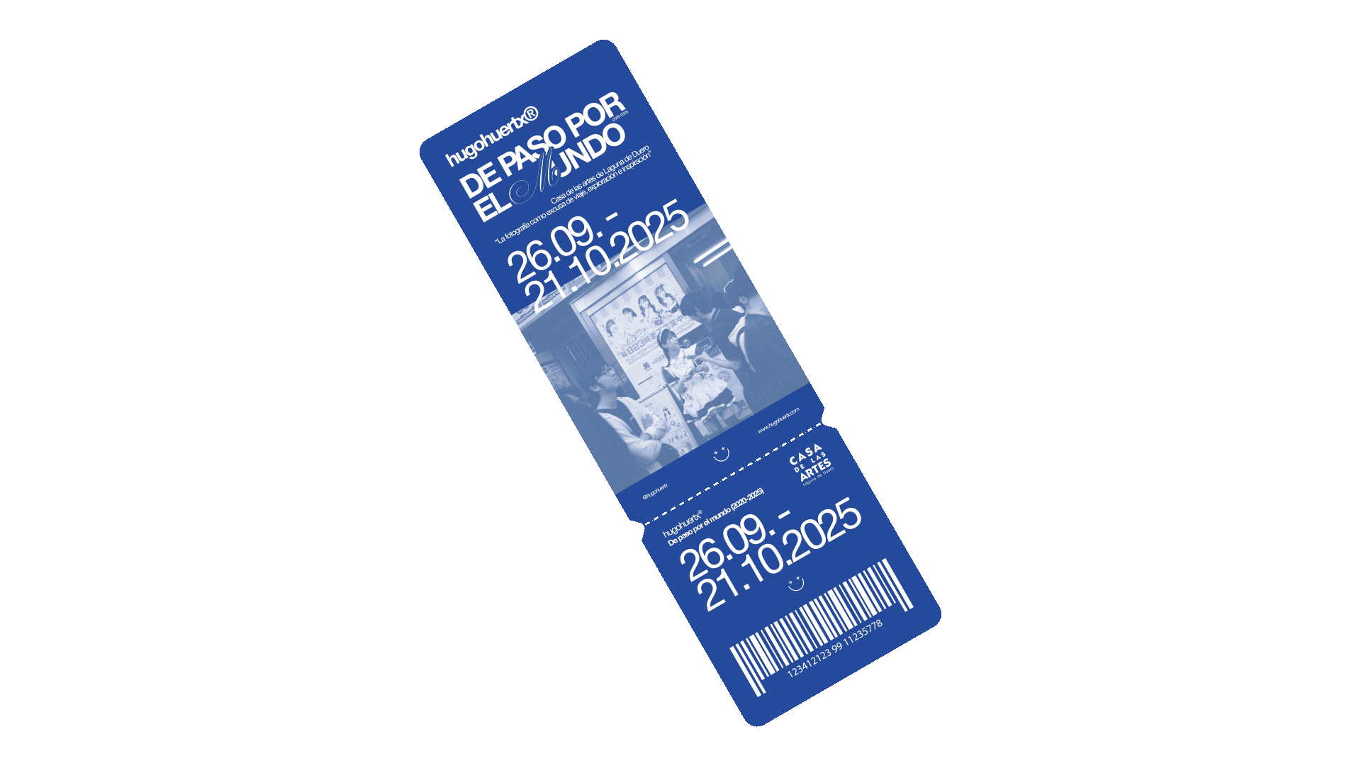
Graphic Elements — “The Logo”
The logo was an exercise in balance, formal yet personal. It doesn’t strictly follow branding conventions; rather, it acts as a symbolic mark that represents the exhibition.
It combines two typefaces: a solid sans serif for structure and clarity, and a handwritten script used only for the “M” in Mundo. This contrast creates harmony between the rational and the emotional, the structured and the organic. The years 2020–2025 appear subtly, closing a creative chapter while leaving the door open to future stages.
Color Palette
The main color is blue elegant, sober, and deep, evoking the sky and the sea as metaphors for travel and openness. Red acts as a secondary accent: energetic and vibrant, used selectively in key applications such as ticket differentiation. While blue evokes calm and reflection, red brings intensity and movement.
Both coexist with white, adding clarity and space, and occasionally black, when required for printing purposes. Together they form a palette that balances tranquility and strength, mirroring what travel photography means to me: a tension between serenity and discovery.

Typography
The project uses Helvetica Neue World in three weights bold, roman, and light. Its neutral and timeless character makes it perfect for this context. The bold gives weight and hierarchy. The roman provides balance. And the light adds subtlety and air.
Together they create a restrained yet expressive system —a typography that supports rather than dominates.
Graphic Applications
Following the same philosophy —creating without pretension, enjoying the process— I extended the visual system into small pieces: flyers, tickets, a fictional receipt, and stickers. They’re more visual experiments than products, meant to imagine how this identity could live in the real world.


This project became, above all, an excuse to create a way to connect my photographic and graphic work, and to explore how an exhibition can have its own visual language.
I wasn’t aiming for corporate branding, but for something freer, more personal, and honest, reflecting both my process and the essence of the exhibition.
Ultimately, I take away the satisfaction of creating without fear, letting the design accompany —without overshadowing— what truly matters: the photographs and the stories behind them.