-
Year: 2025 – ongoing
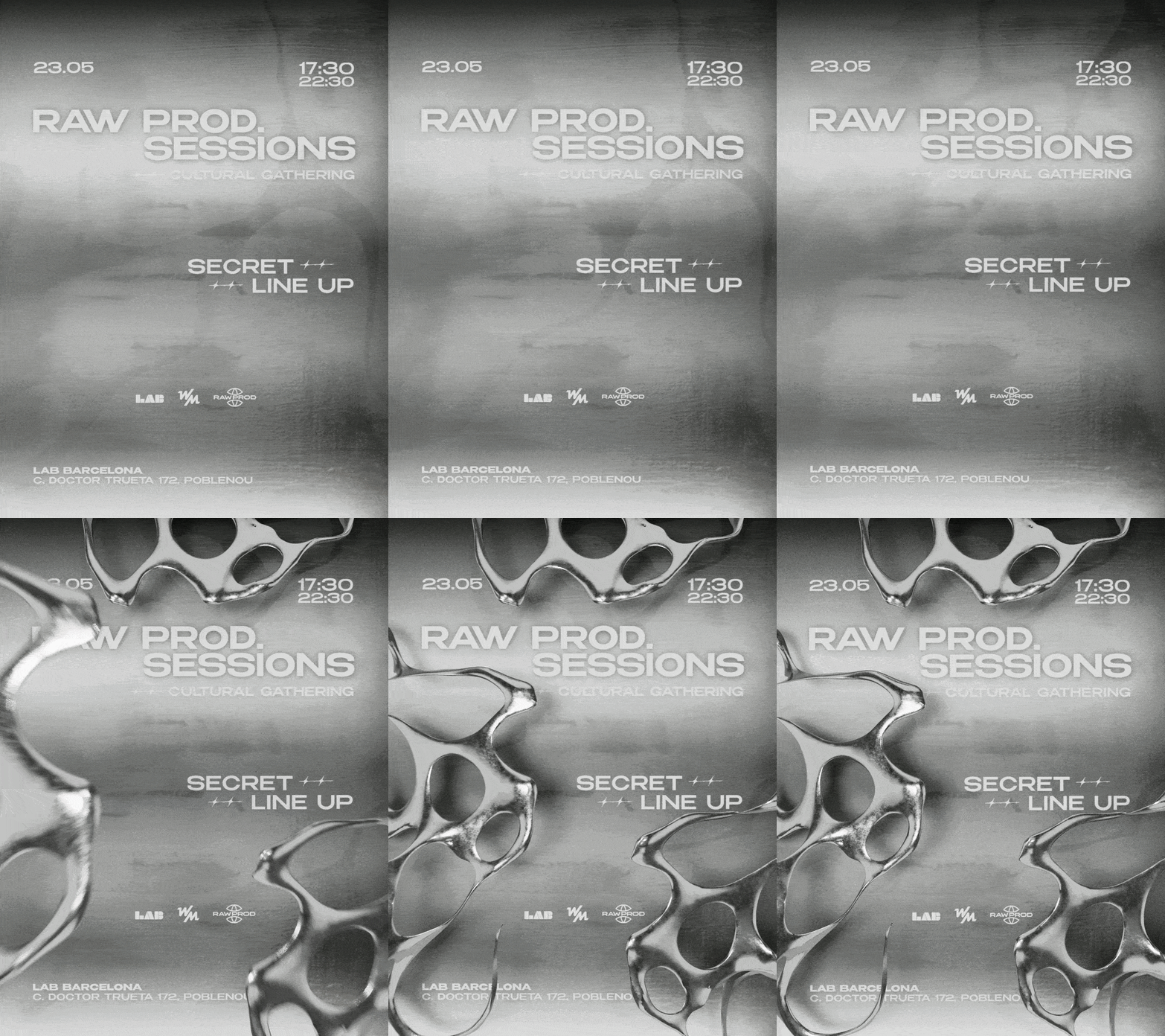
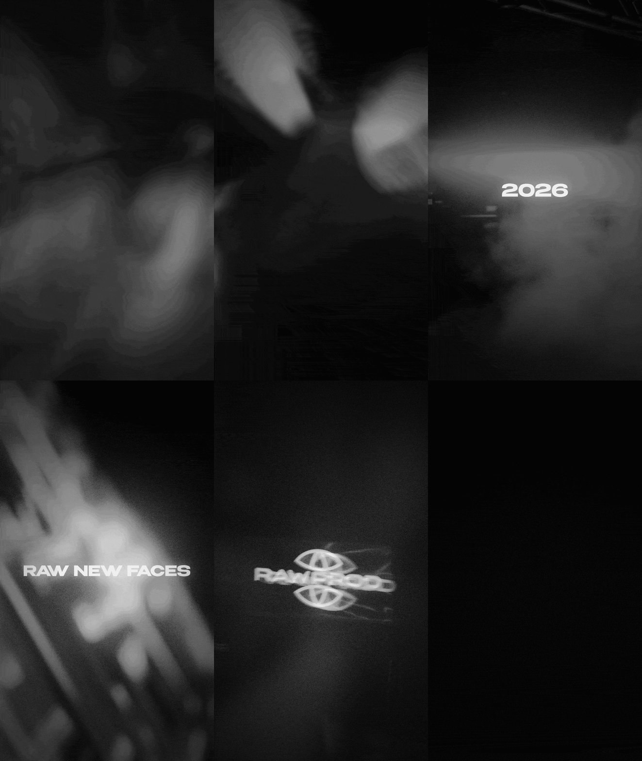
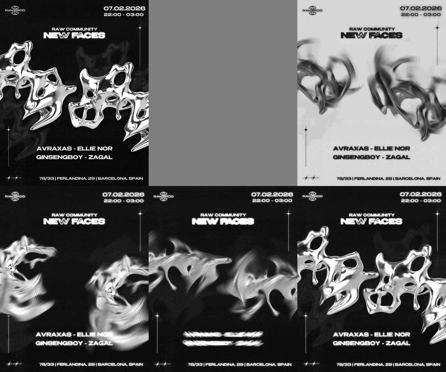
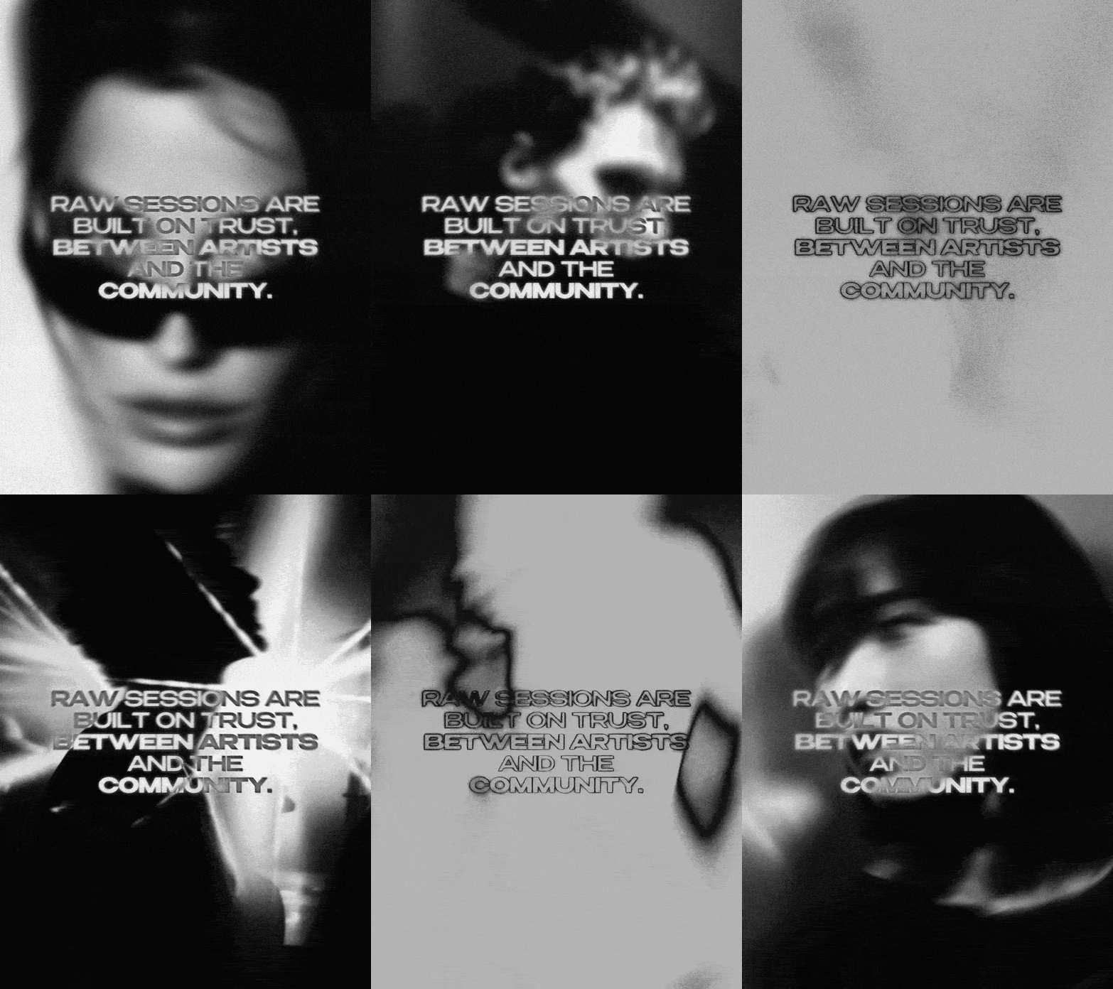
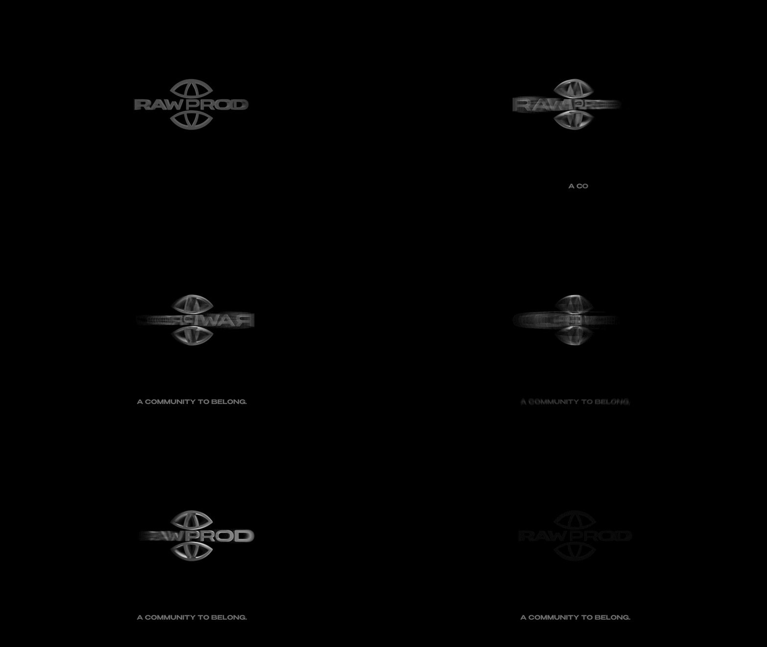
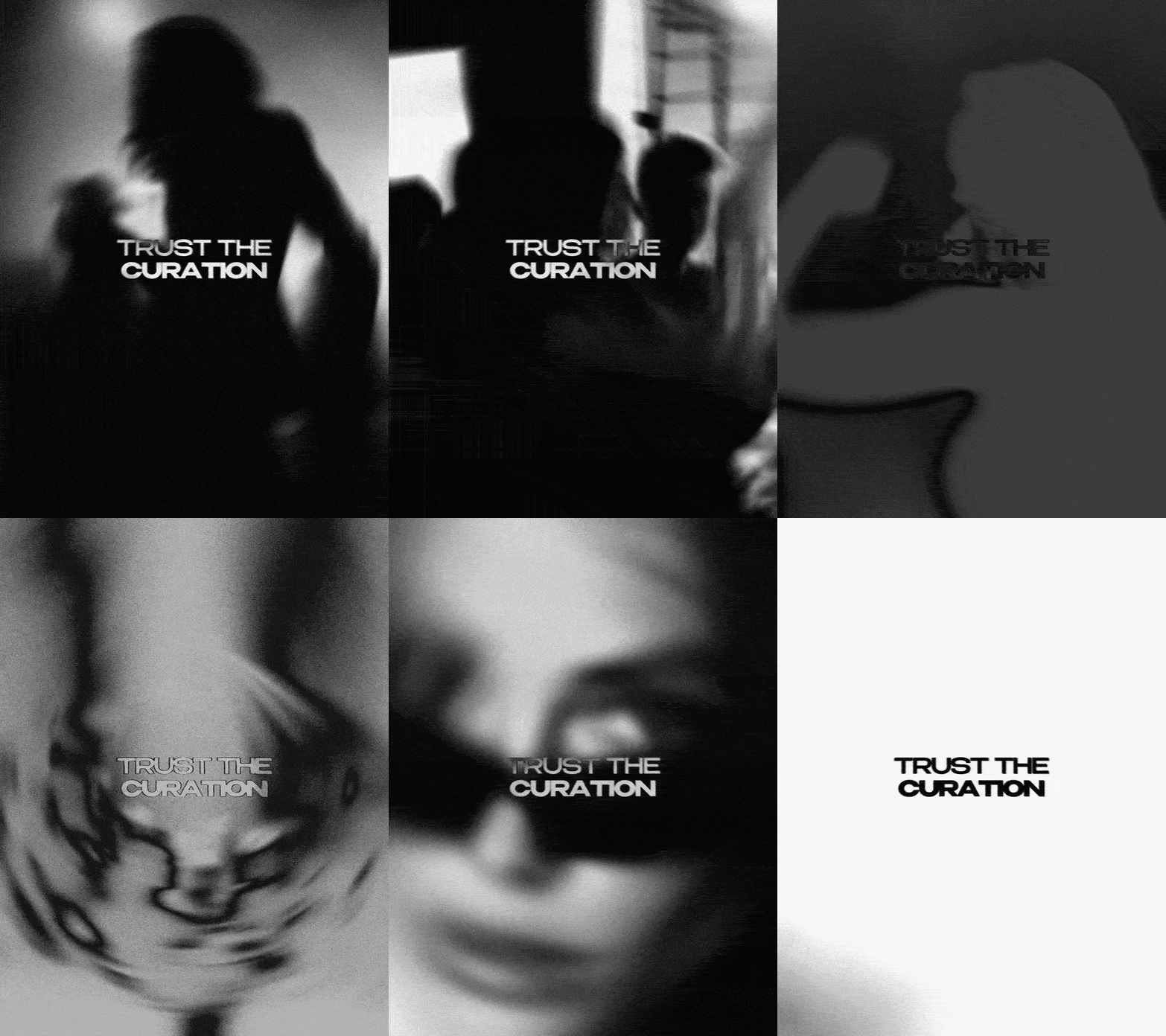
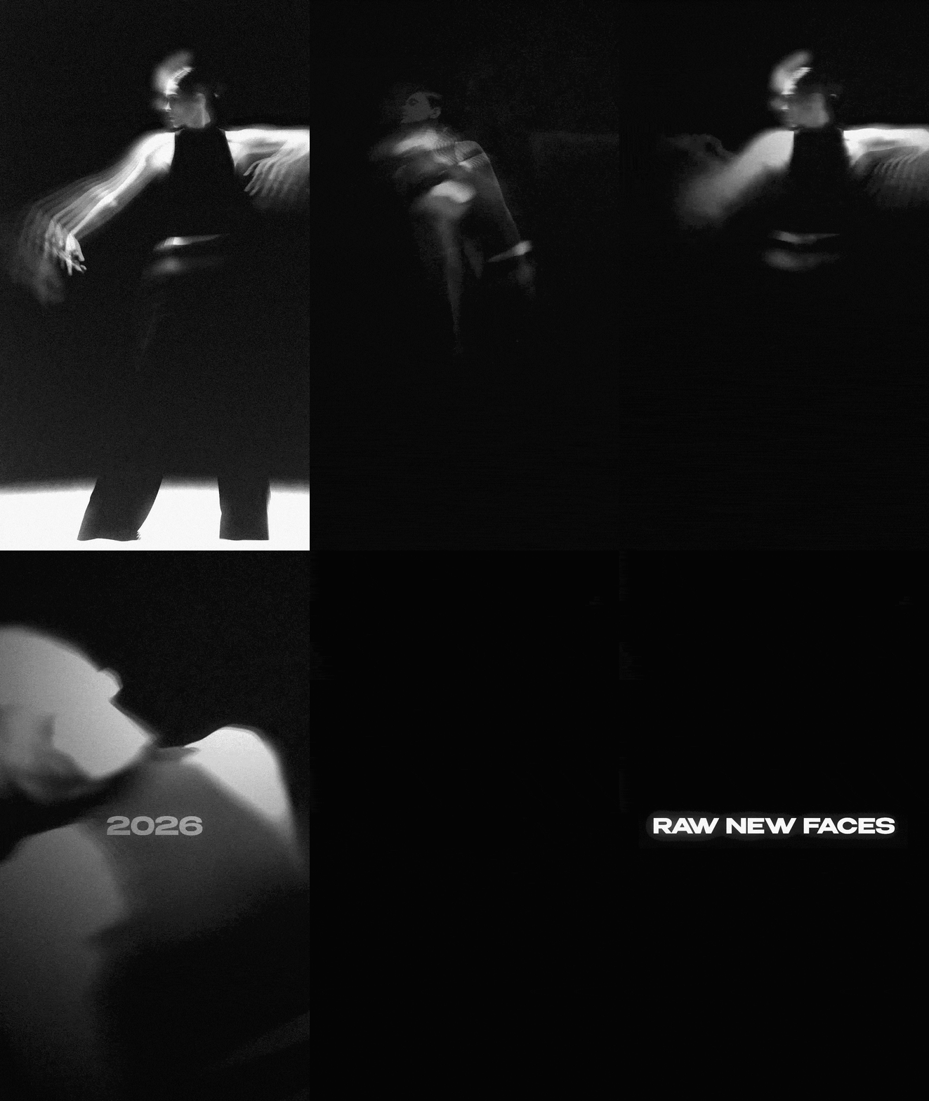
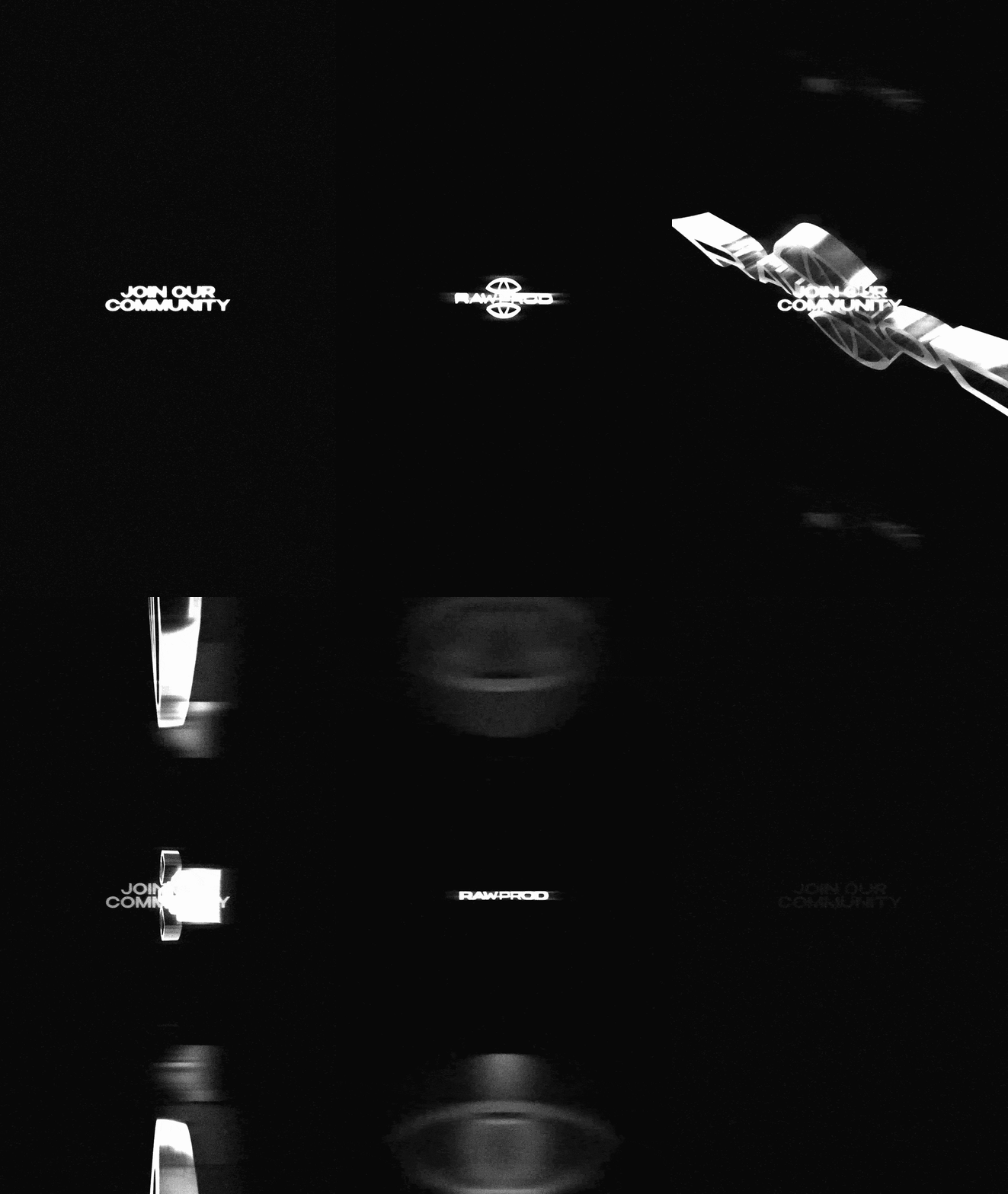
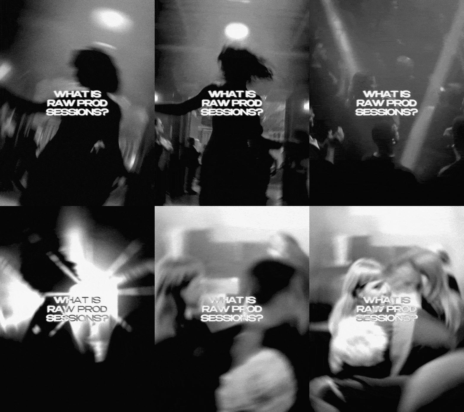
A movement dedicated to high-quality techno curation based on respect, inclusion, and the creation of safe spaces for the electronic community. As a close collaborator, my role is to give a tangible, moving form to the brand's established aesthetic, ensuring their visual communication matches the intensity of their sound.
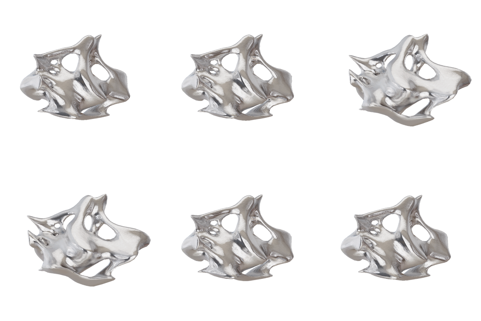
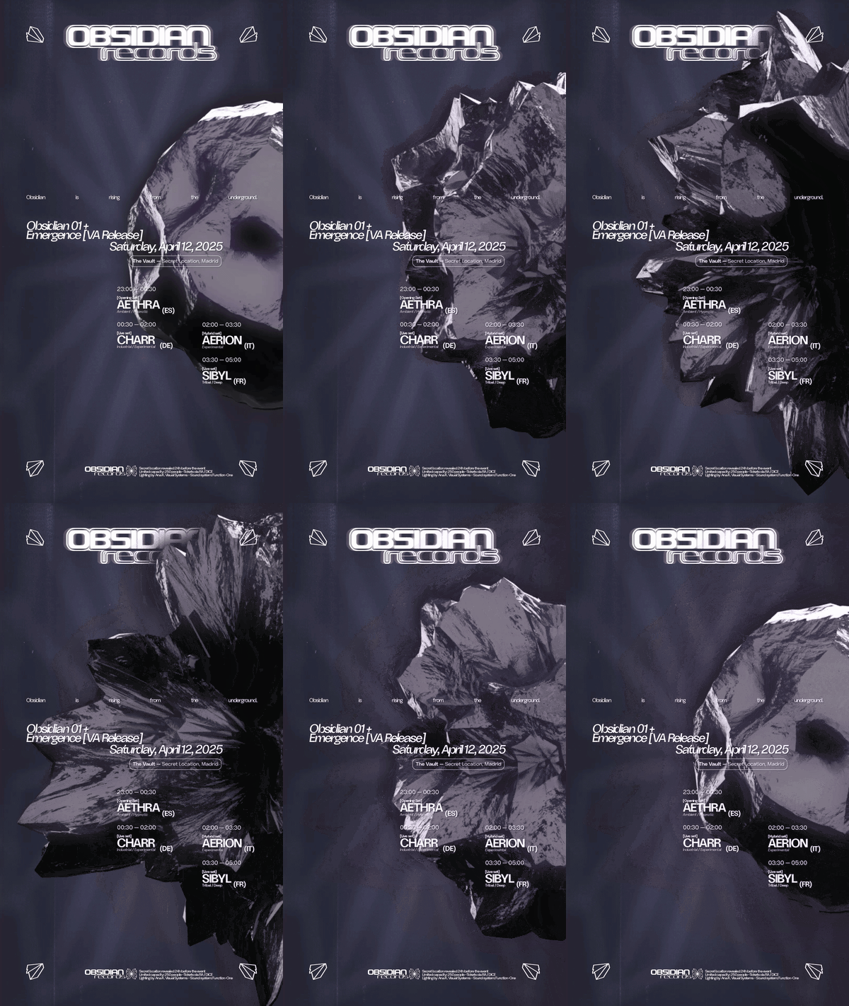
My contribution focuses on a "meticulous artisan" approach to digital art. I develop custom 3D abstract shapes that reflect the raw and complex nature of the techno being promoted. These forms are later integrated into dynamic motion content, creating a high-impact visual narrative for each event's scheduled communication.
-
Year: 2025
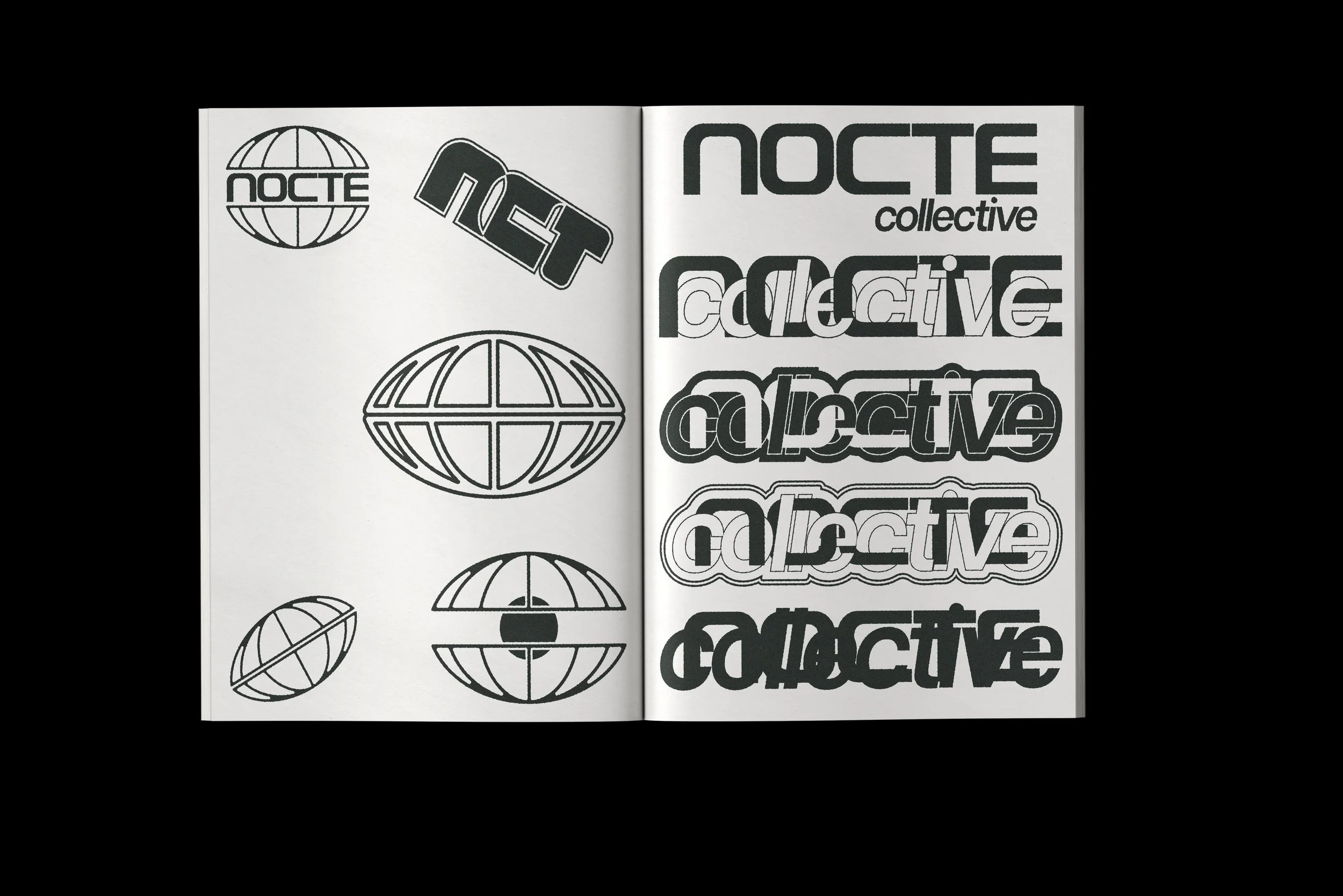
The concept draws from DIY printing methods, low-tech design approaches and the imperfect beauty of self-produced materials. A visual language that feels intimate and real — close to the people behind it, not above them.
The identity is built around a typographic system with strong character, designed to work across flyers, digital communication and physical formats. Every element was considered to reflect the collective's values: simple, honest, and driven by the spirit of early-stage creative movements.
The result is a brand that doesn't perform sophistication. It earns it.



-
Year: 2026
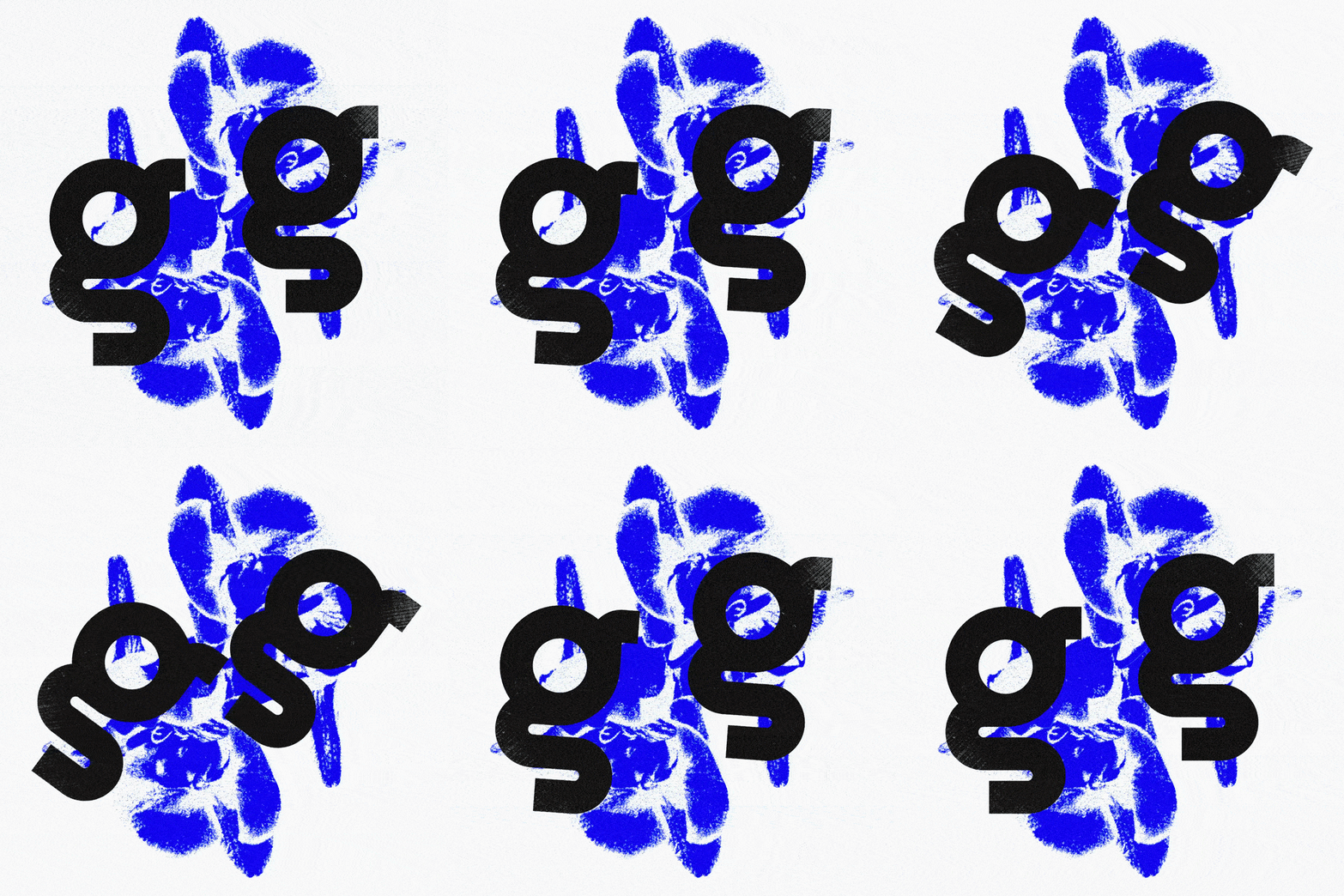
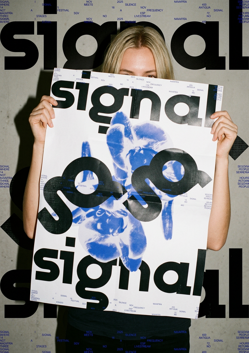
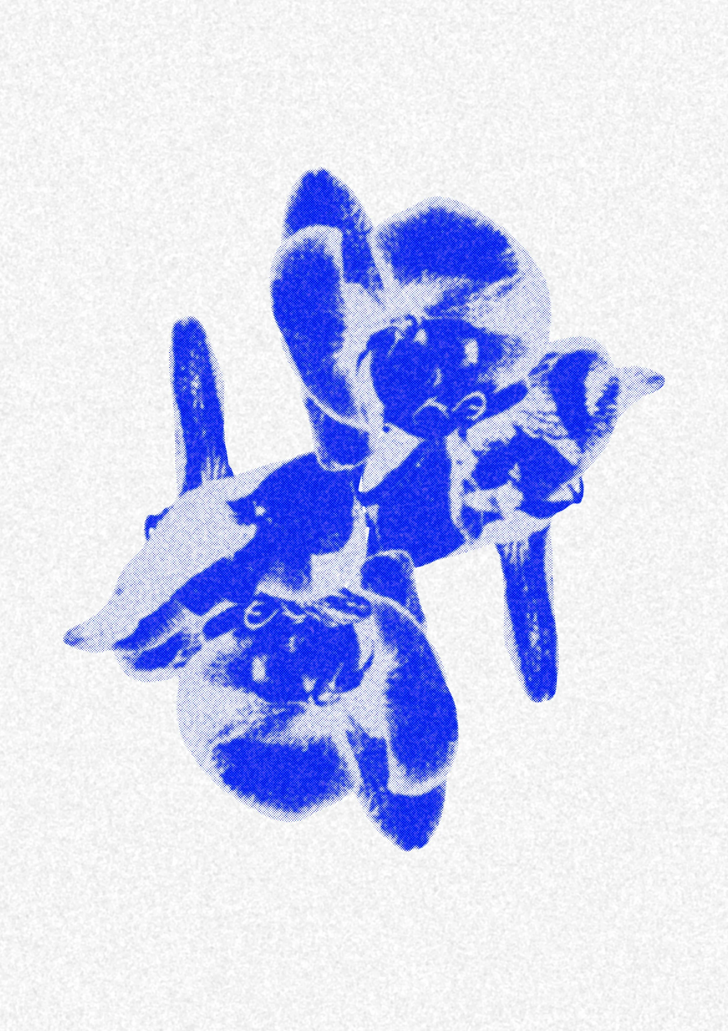
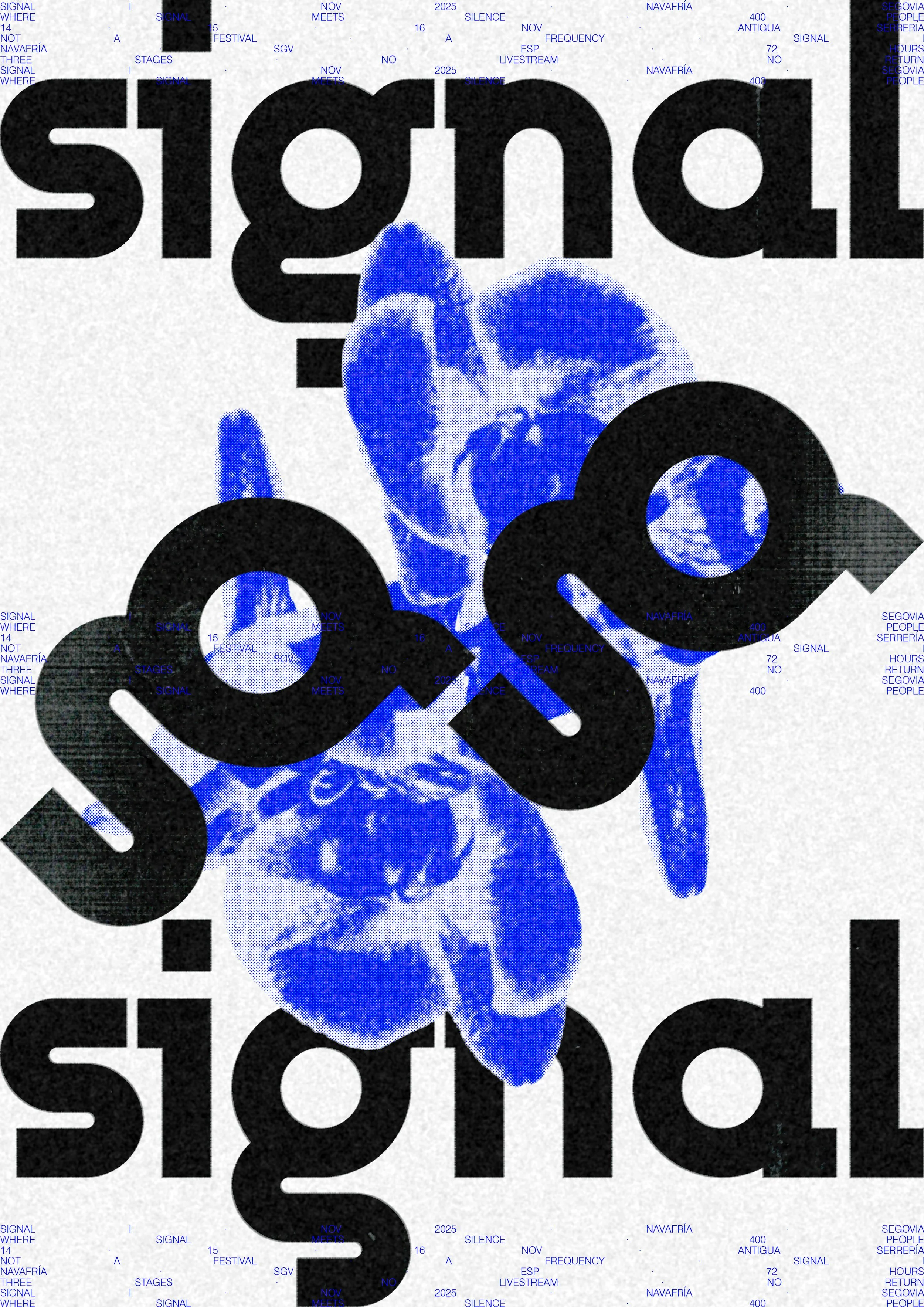
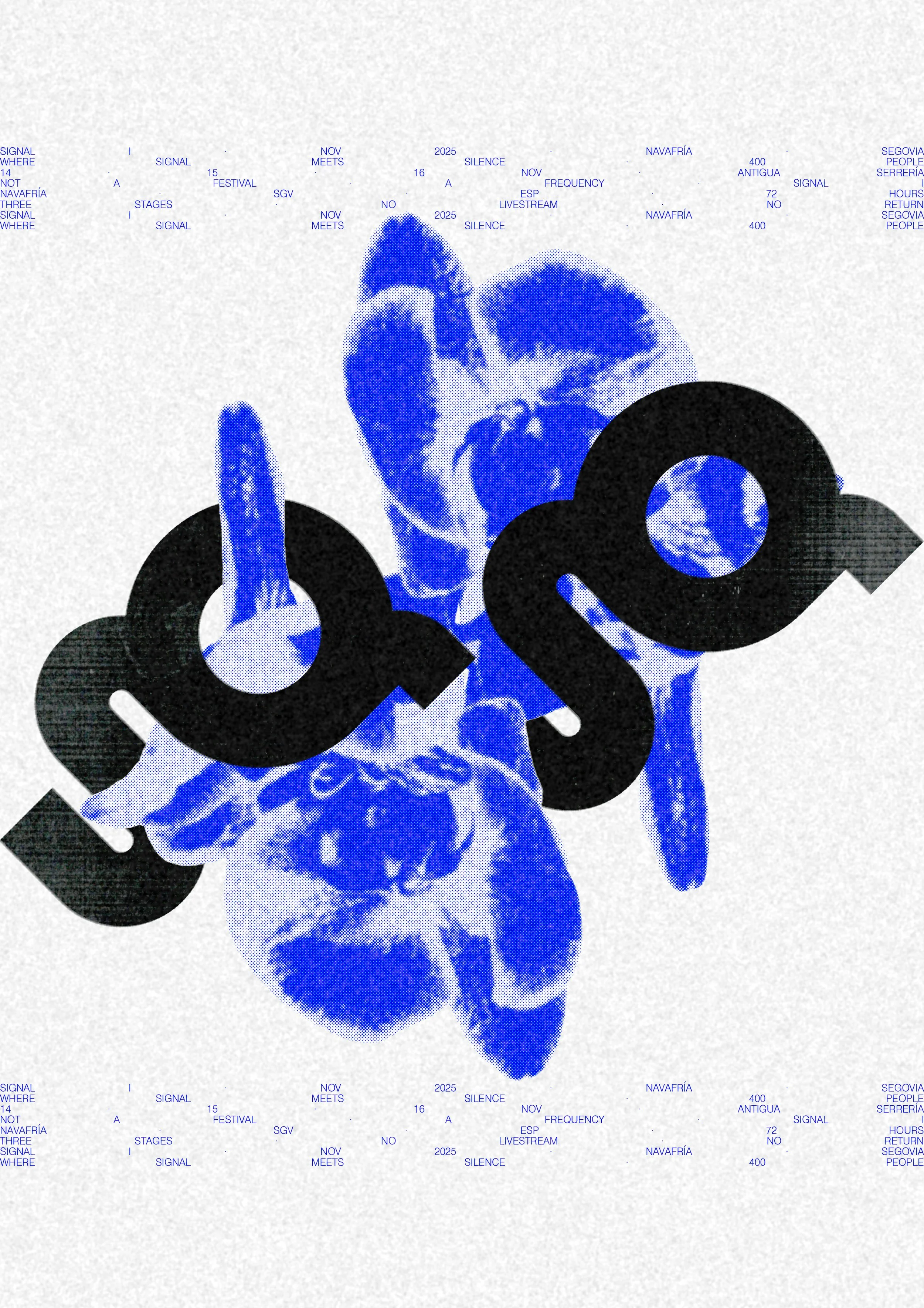
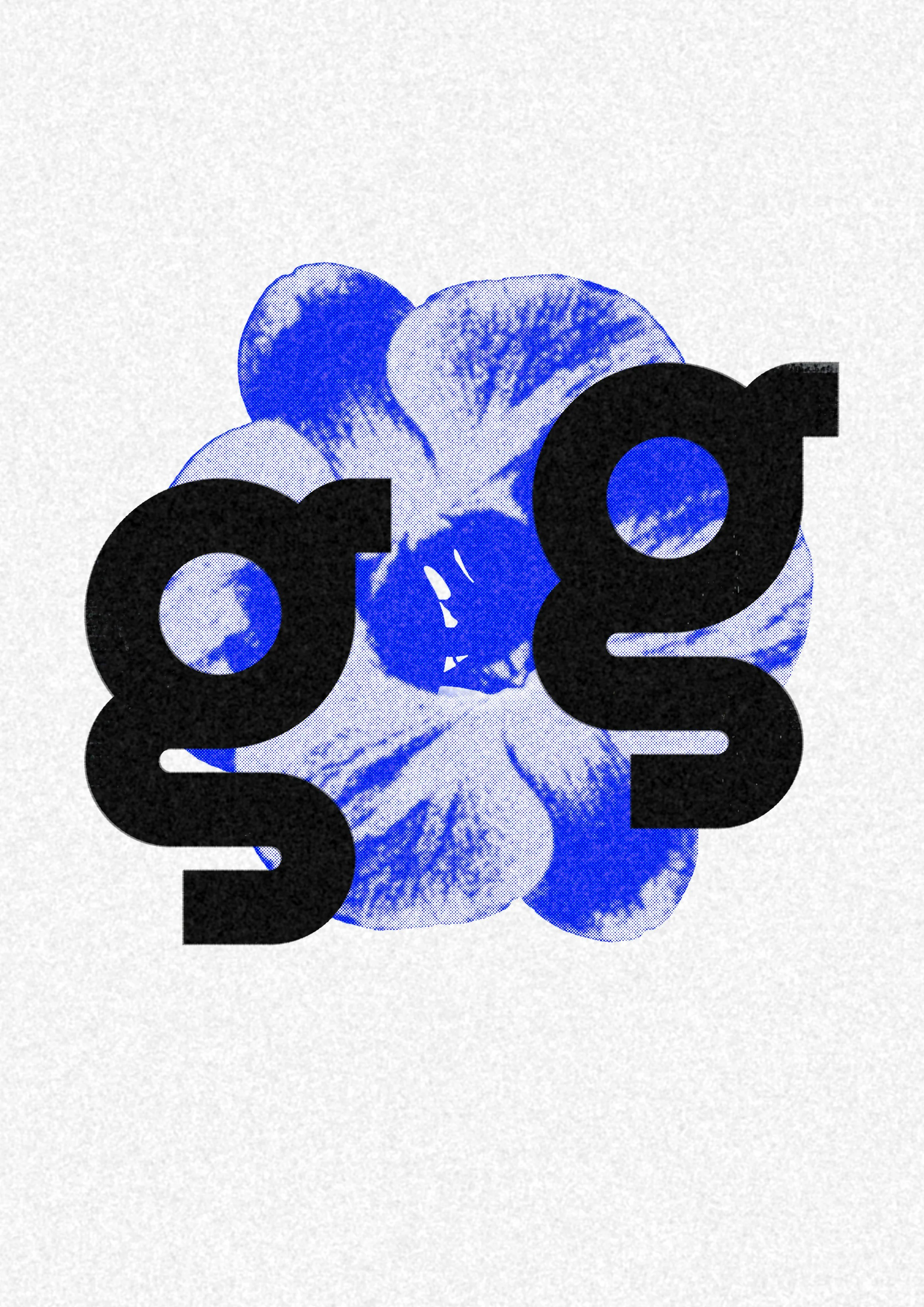
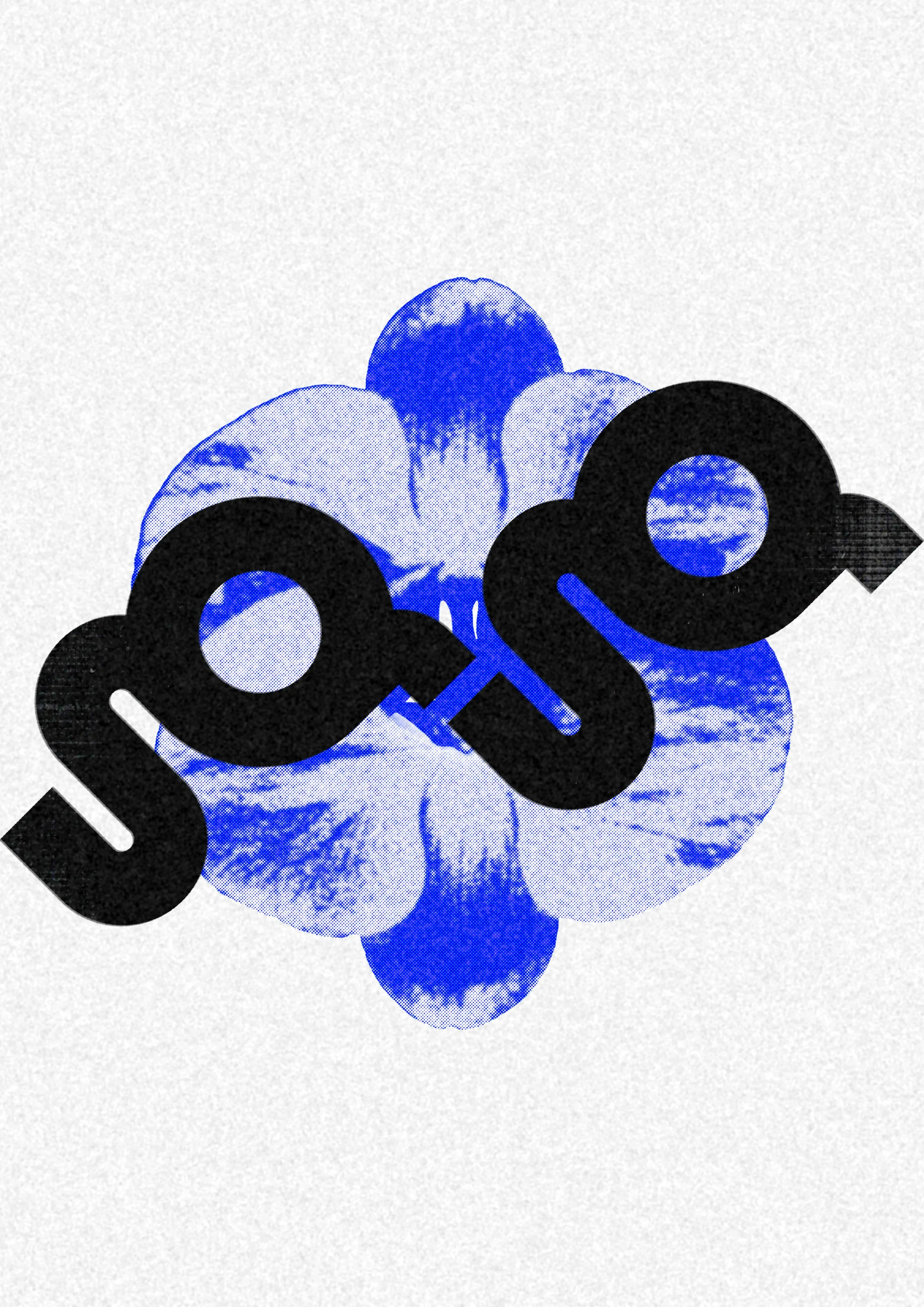
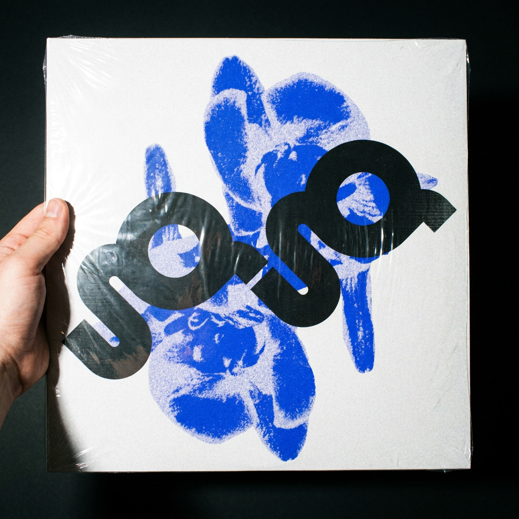
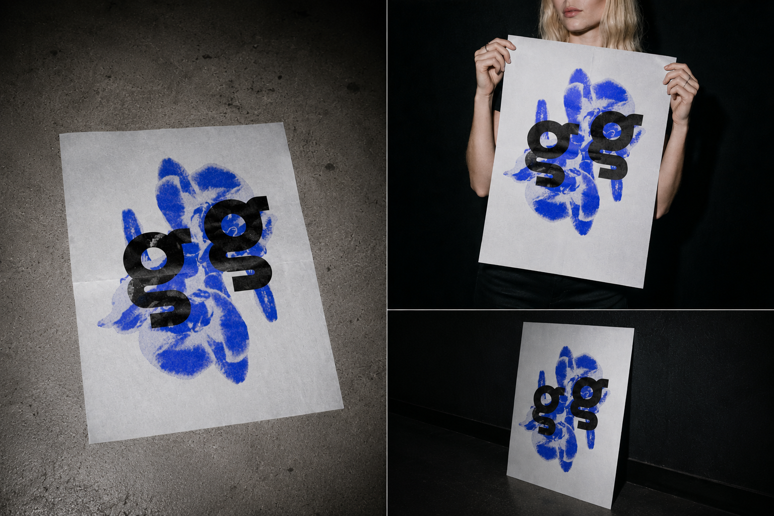
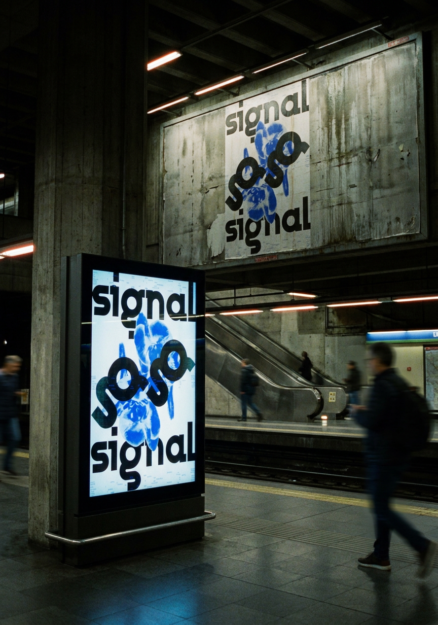
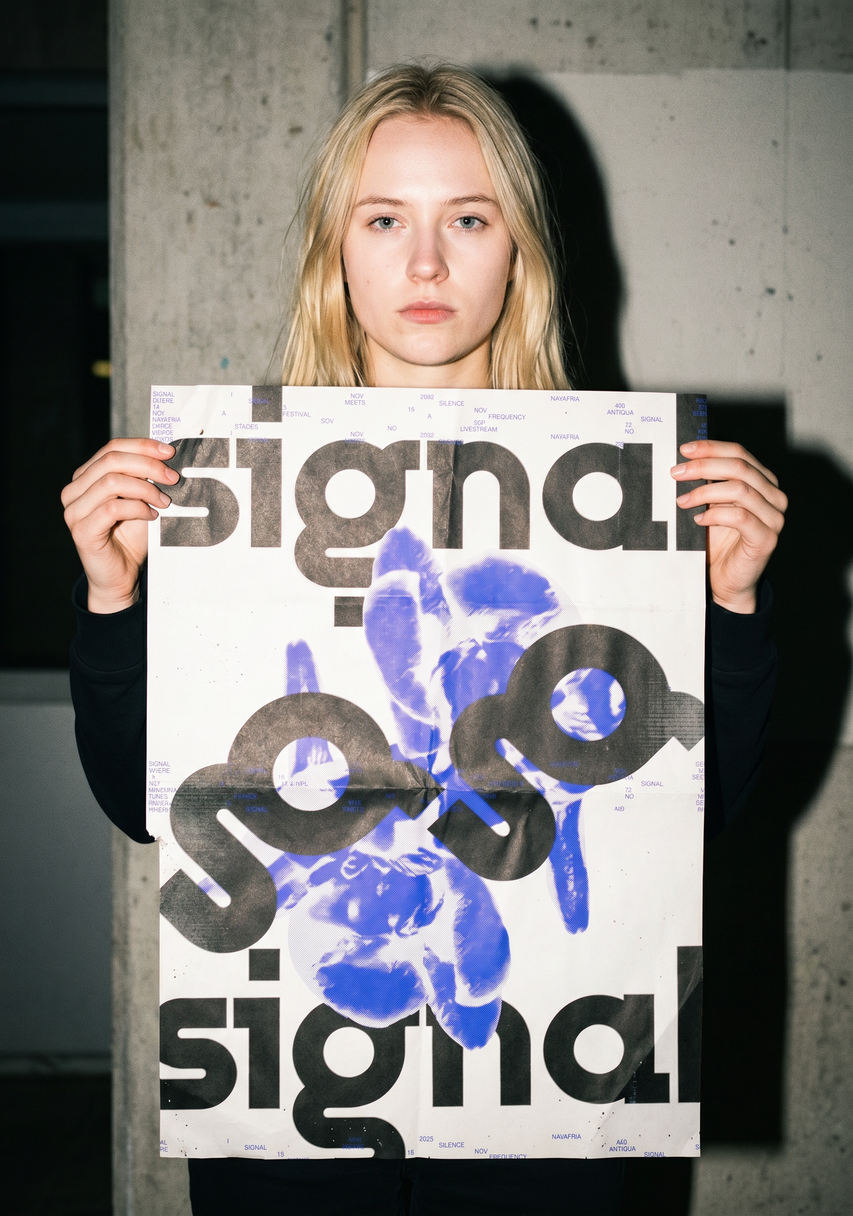
Self-initiated festival concept. SIGNAL is a three-day experimental music event set in an abandoned sawmill in rural Segovia, four hundred people, three stages, no livestream. The visual identity draws from industrial communication systems and technical documentation aesthetics, translated into a complete graphic system spanning print, motion, signage and social media.
-
Year: 2026
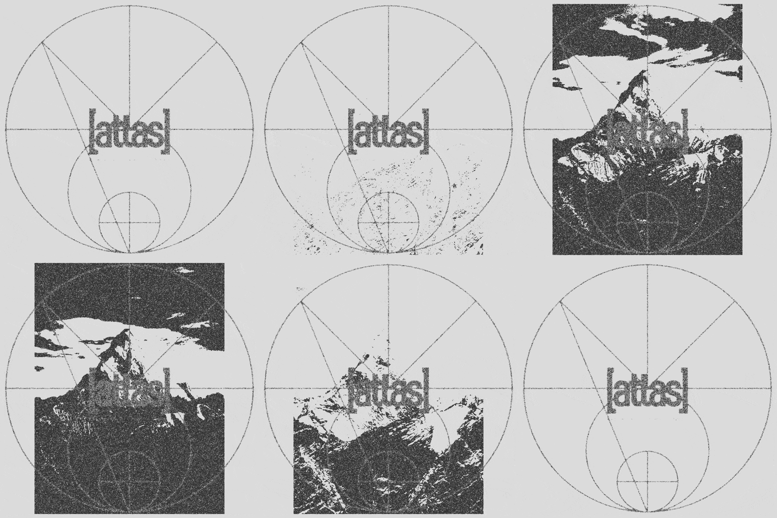
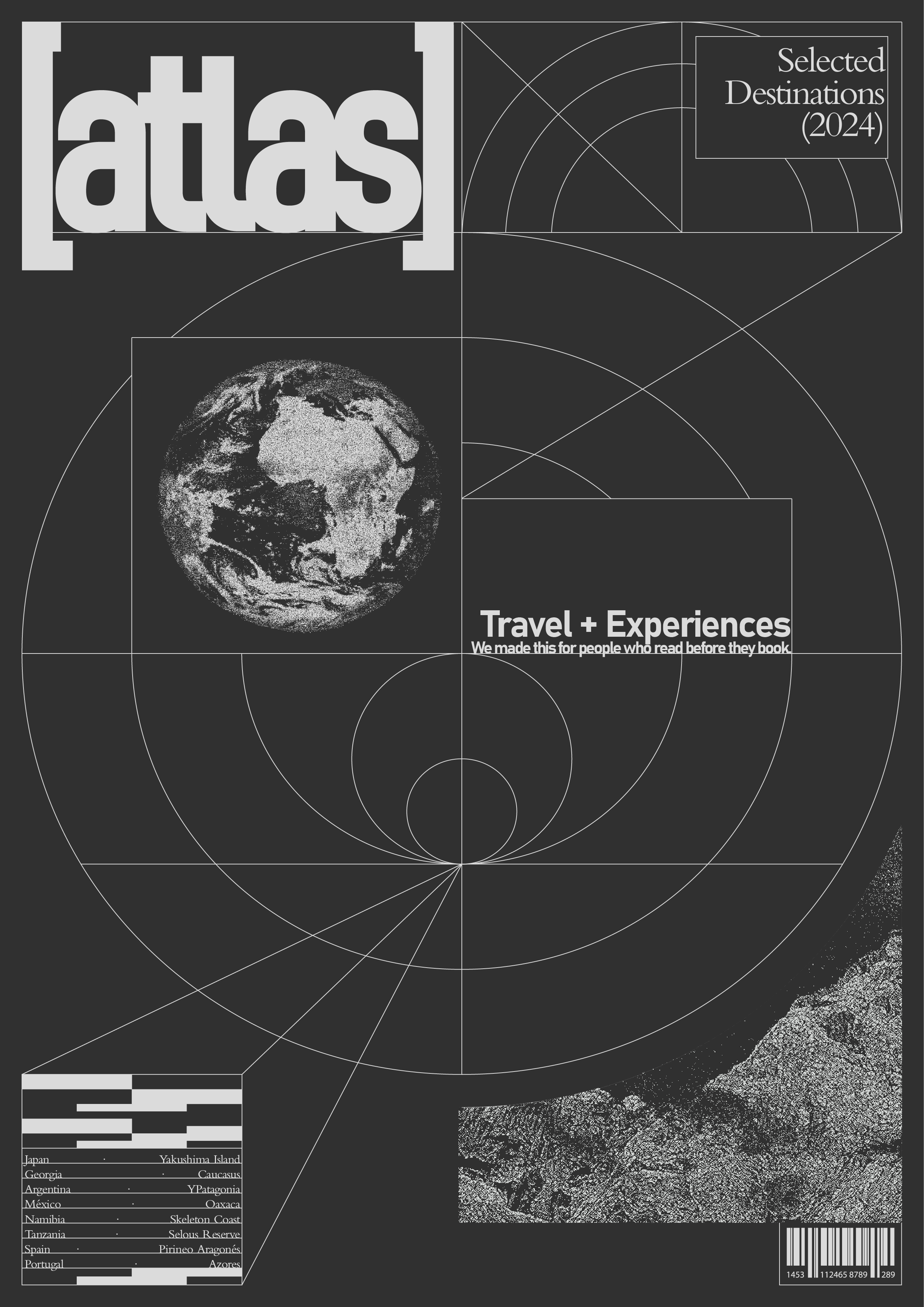
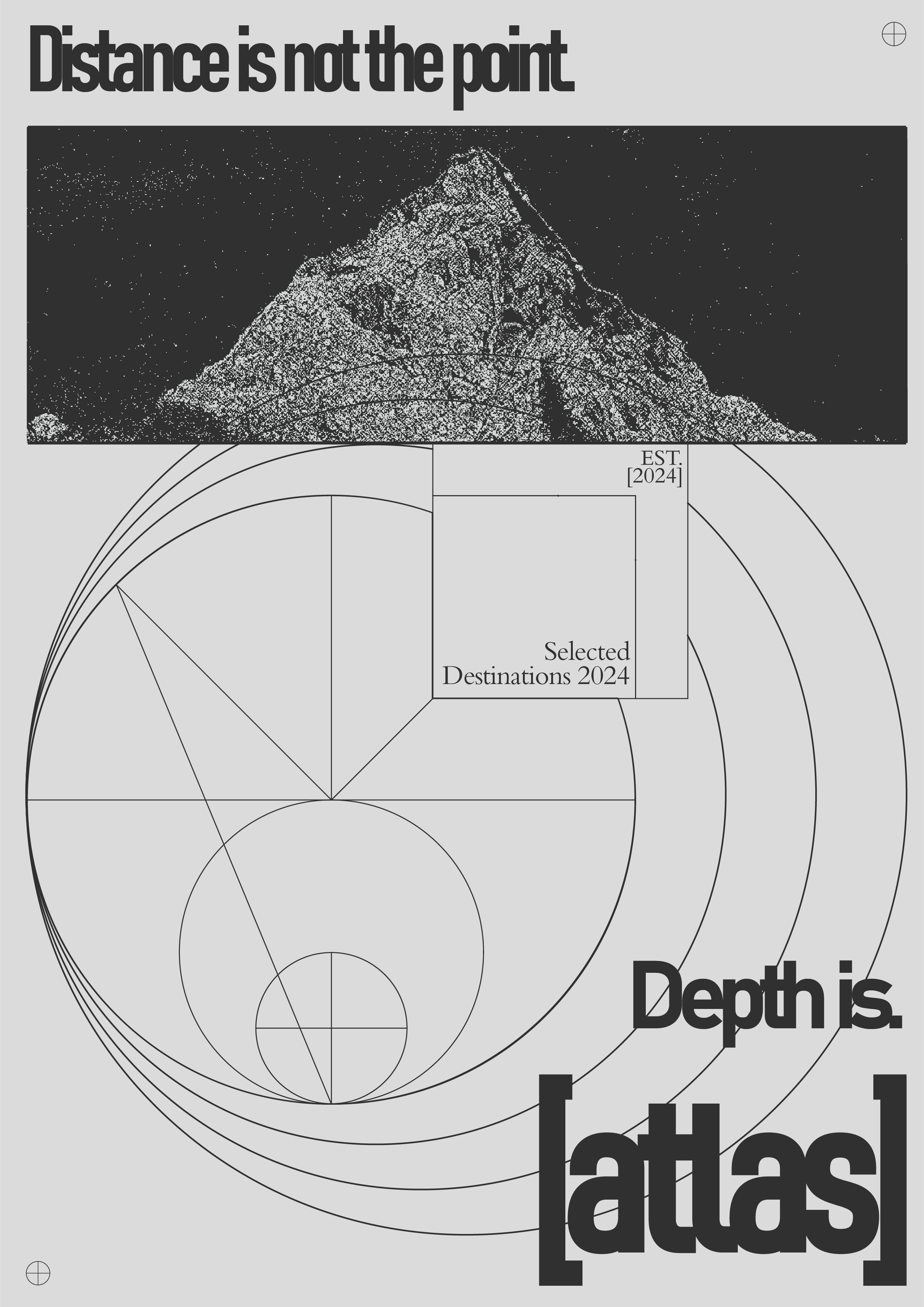
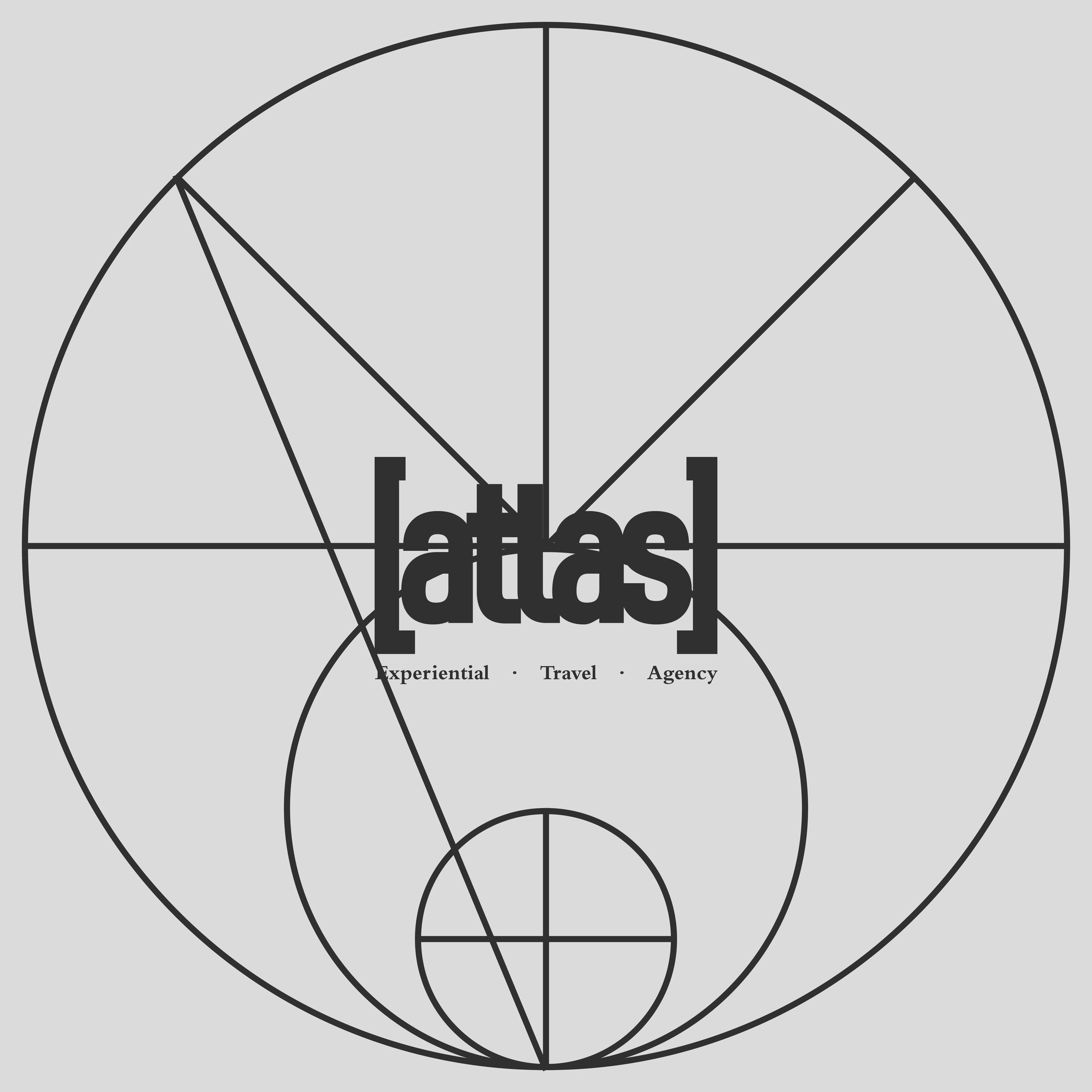
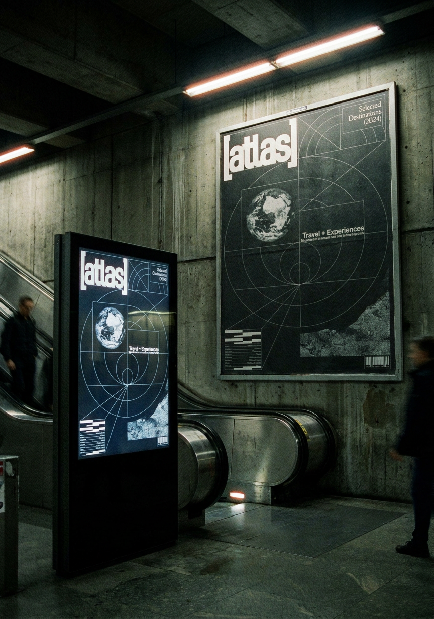
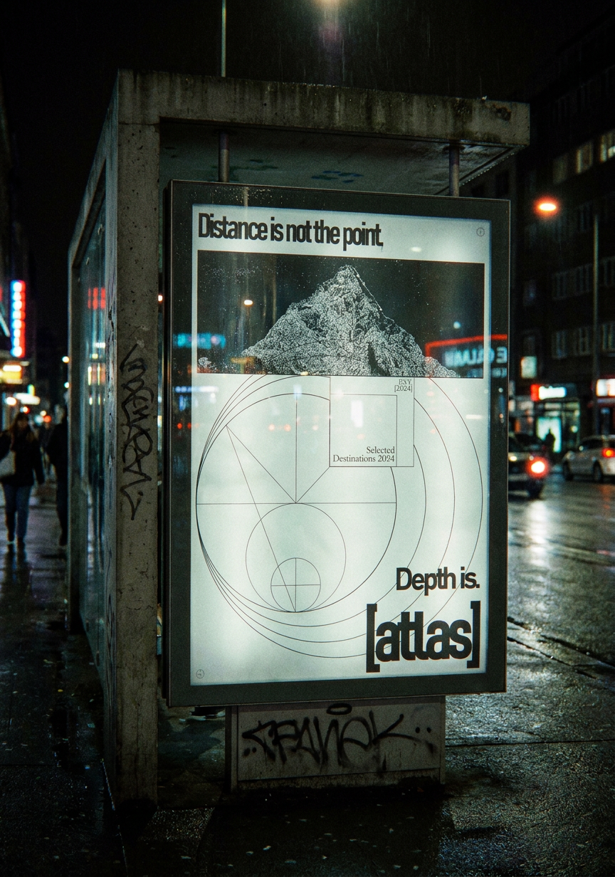
The identity is rooted in the visual language of cartography + coordinates, contour lines, topographic references, reinterpreted through a contemporary lens. A typographic system that balances a strong serif for destination names with a clean grotesque for functional information, reflecting the tension between the romantic and the precise that defines considered travel.
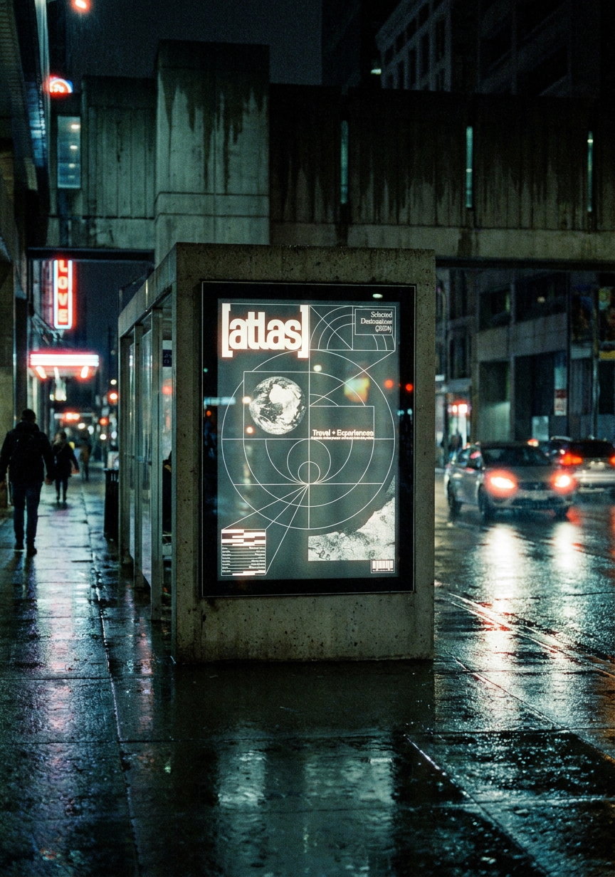
The project covers the full brand system: logo and visual identity, editorial design for a seasonal catalogue, digital campaign assets, Figma web design and social media content. Every touchpoint was considered to feel like the agency itself, understated, confident and worth the journey.

-
Year: 2025
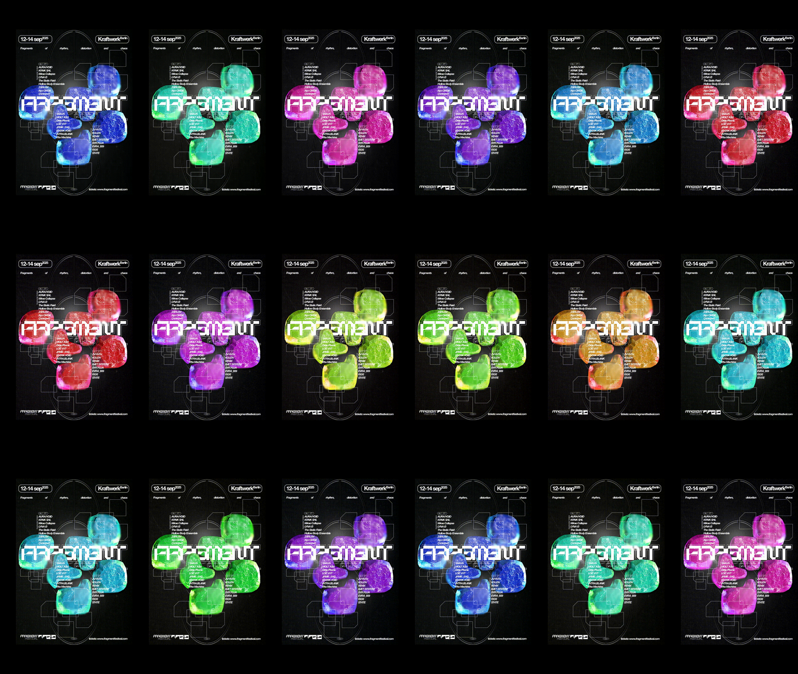
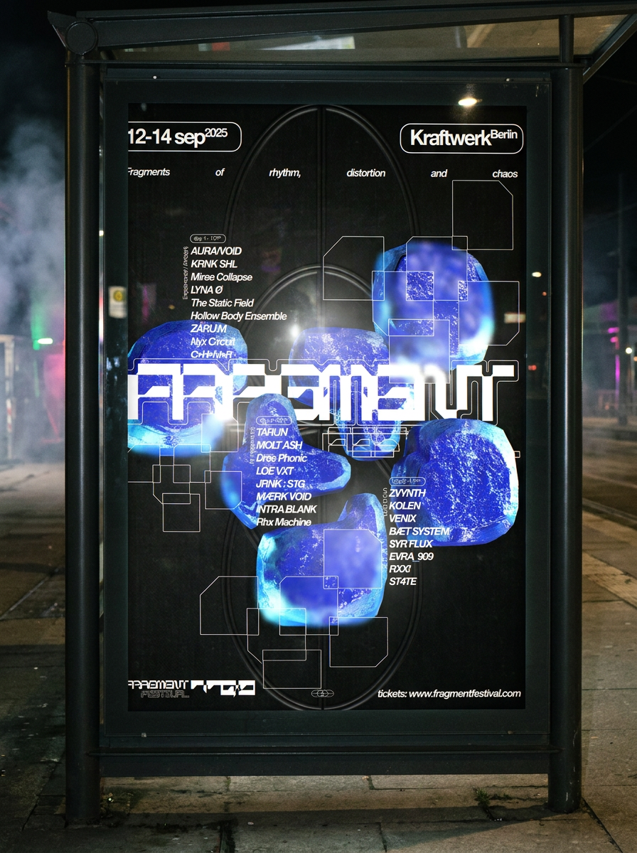
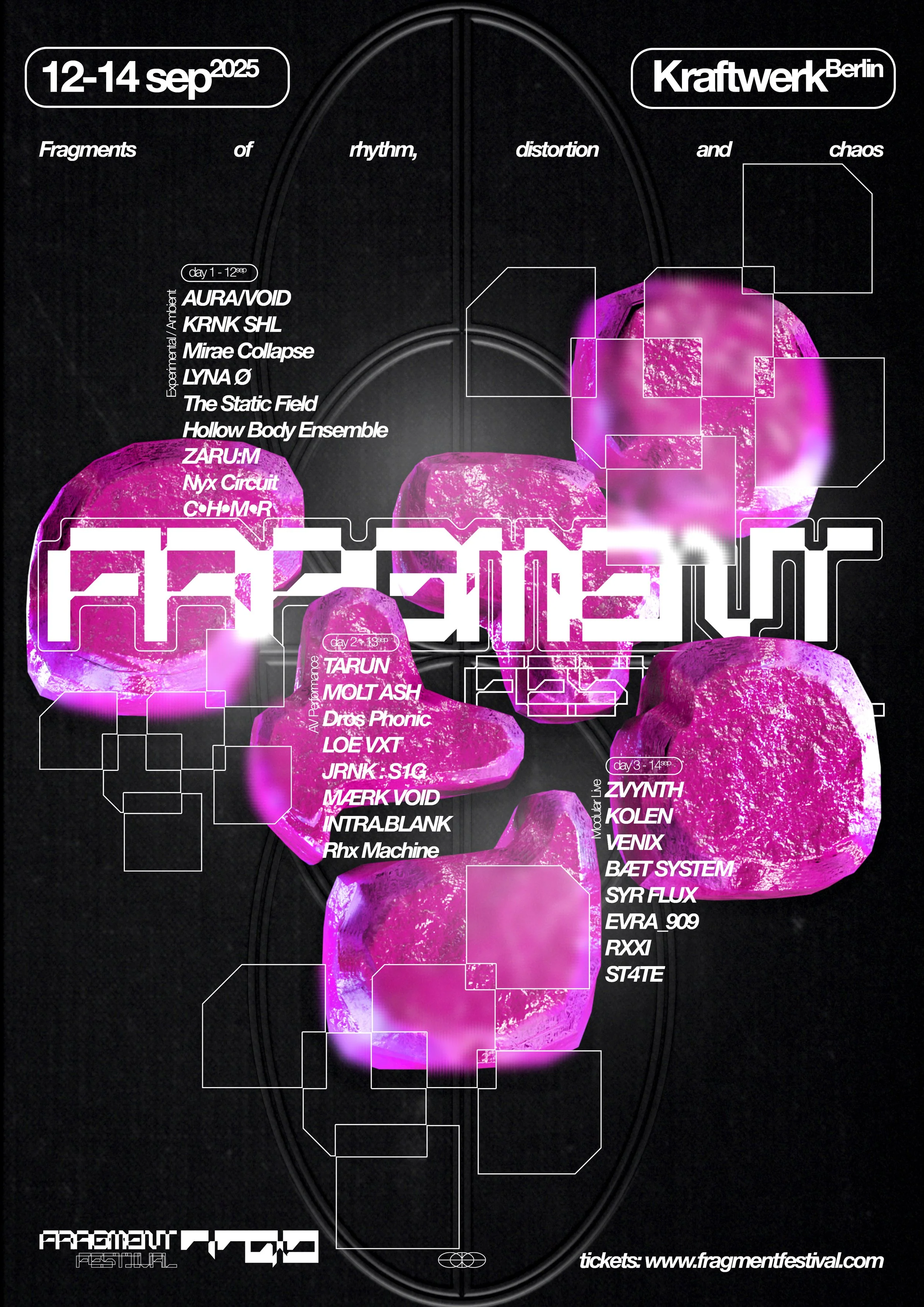
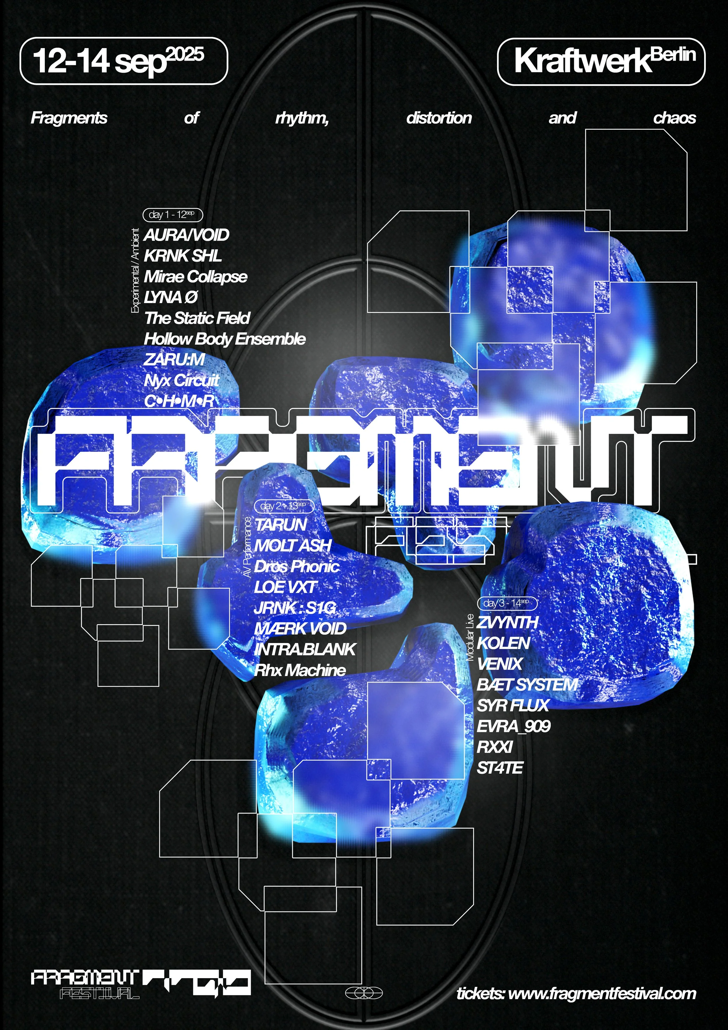
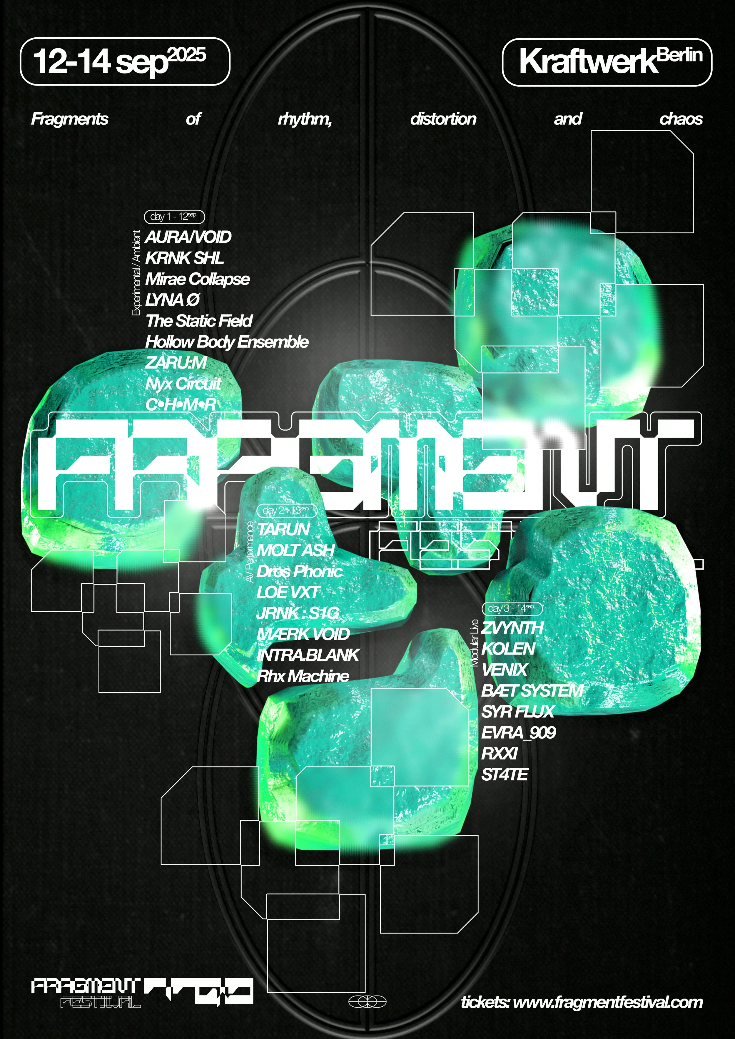
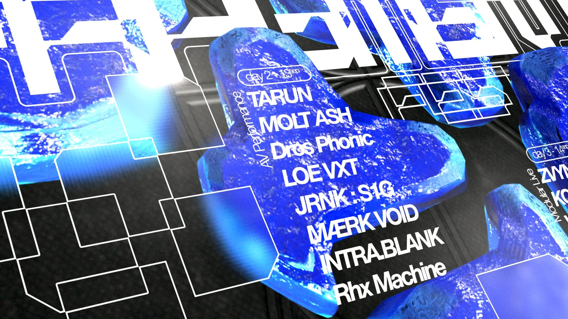
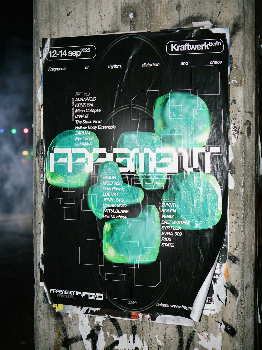
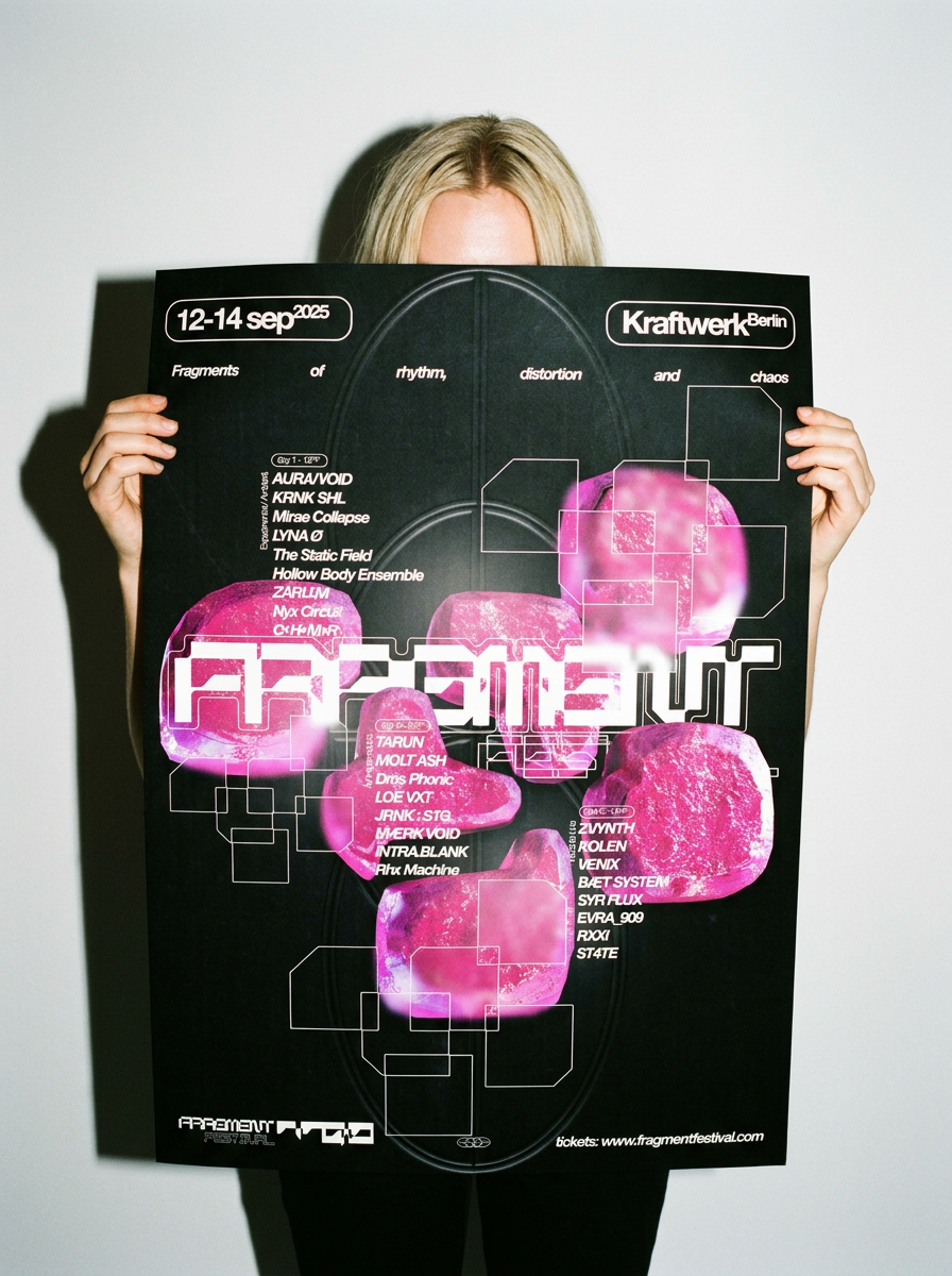
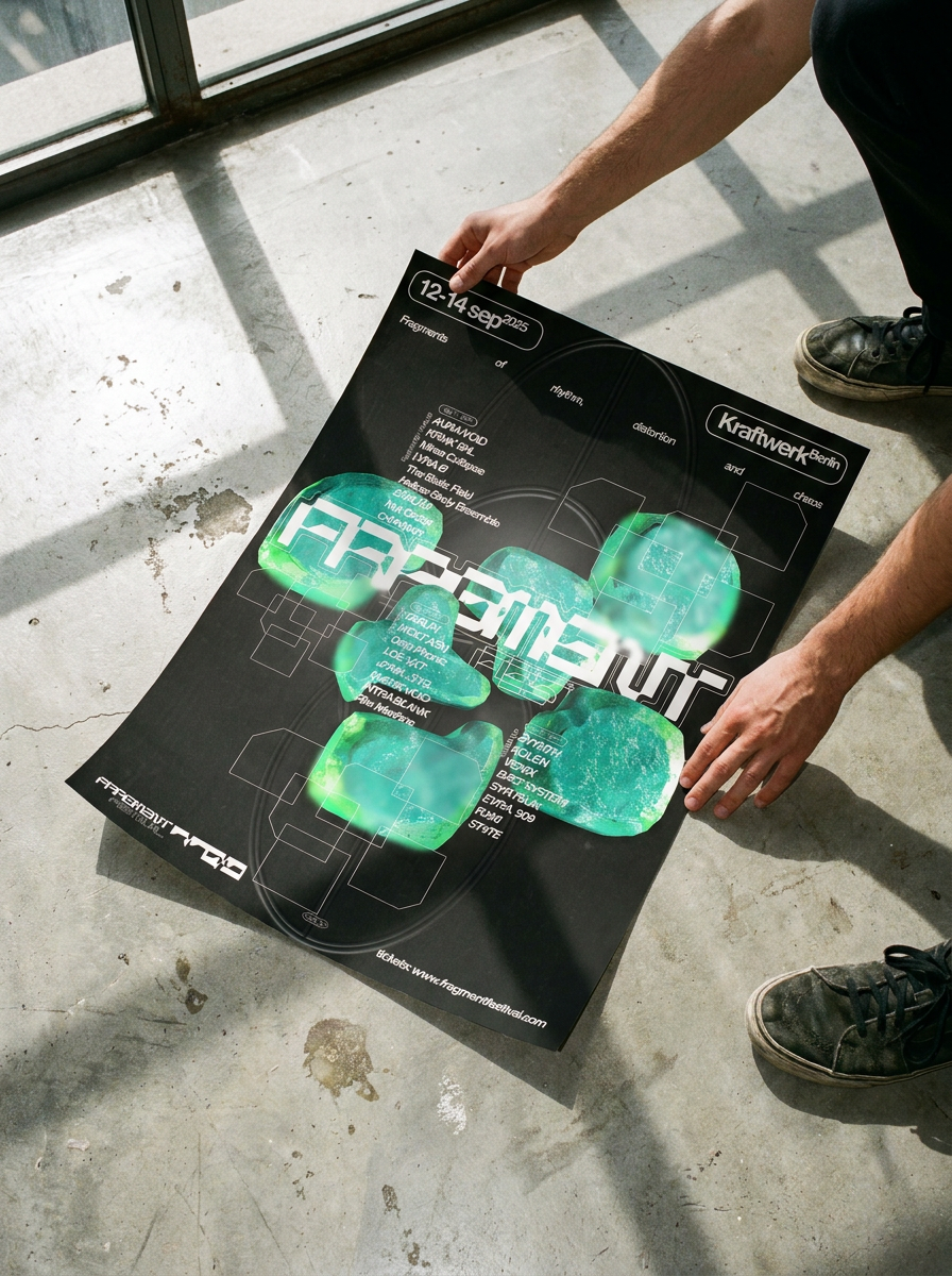
Series of posters and visual assets created for a music festival communication campaign. The project combines experimental graphic compositions, bold typography, and immersive elements to build a contemporary visual identity inspired by underground electronic culture.
-
Year: 2026
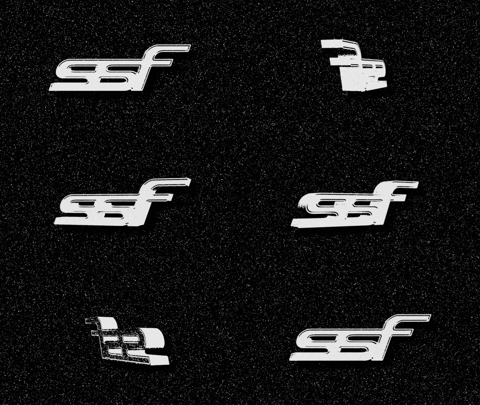
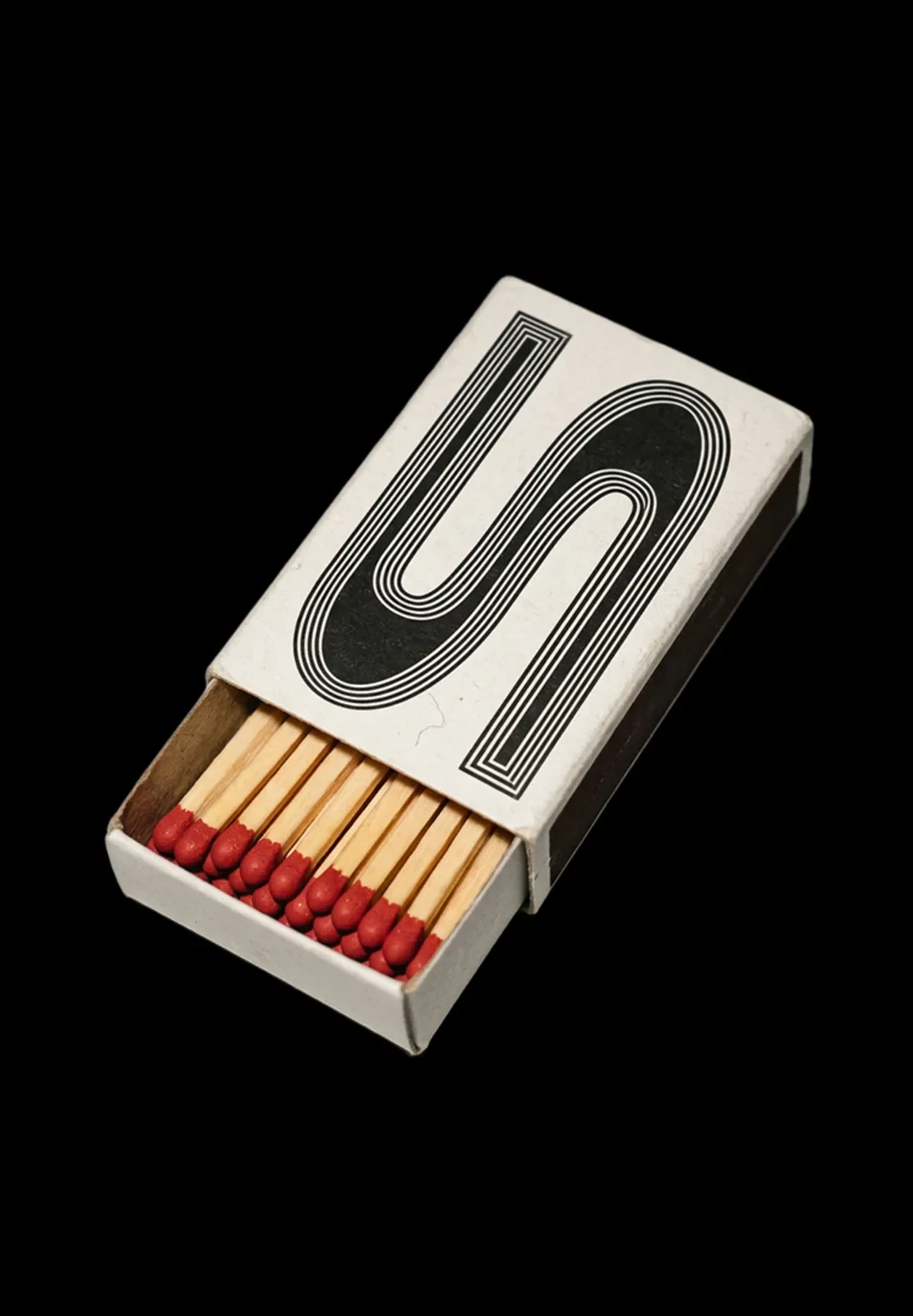
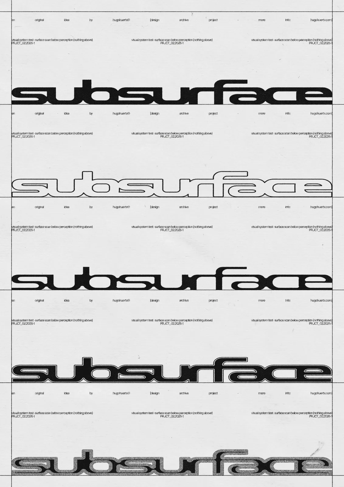
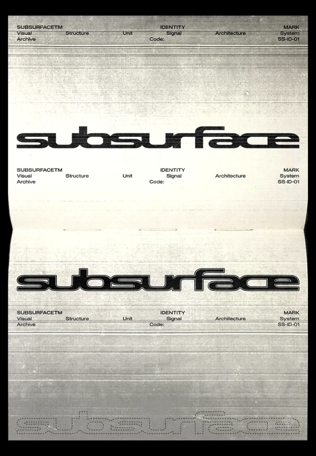
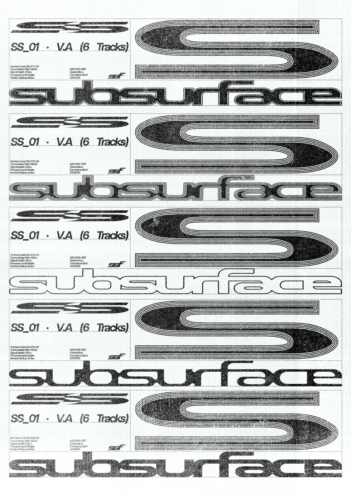
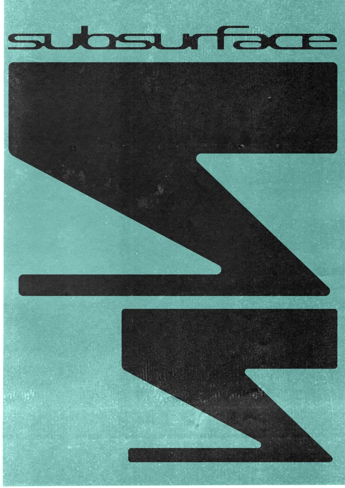
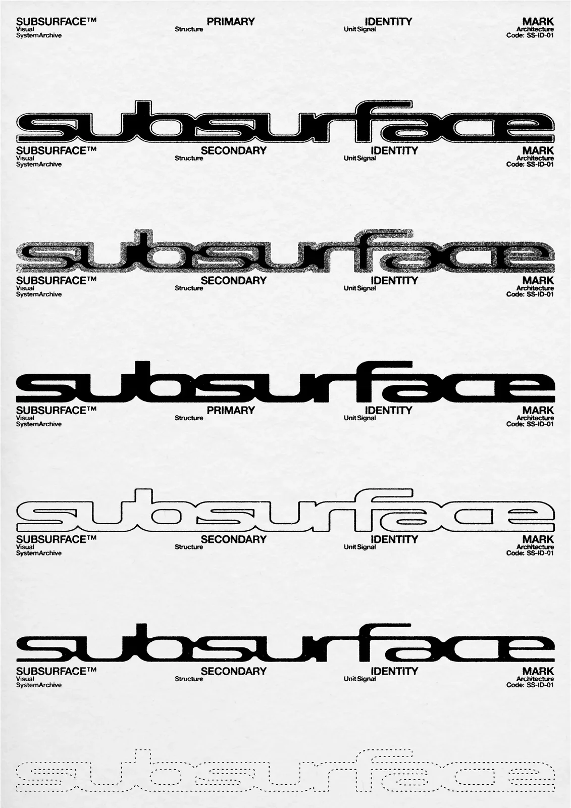
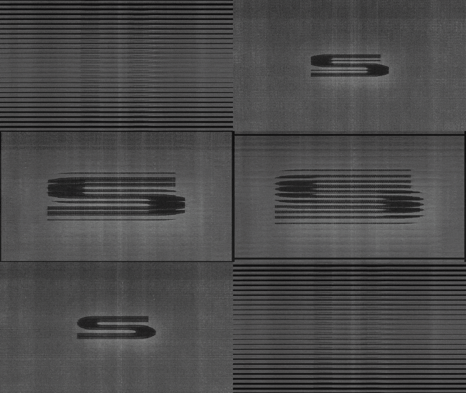
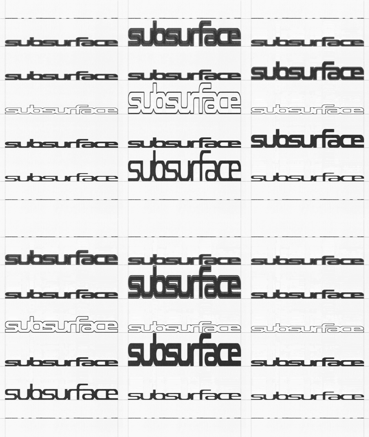
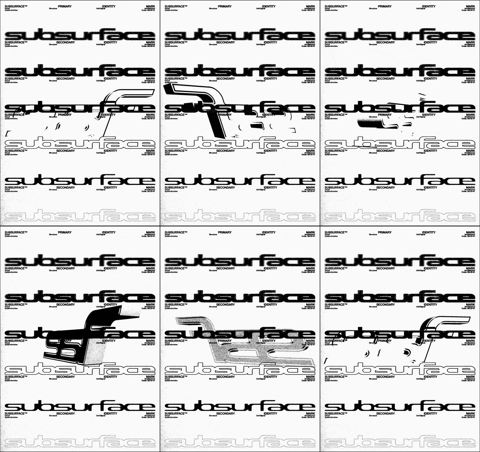
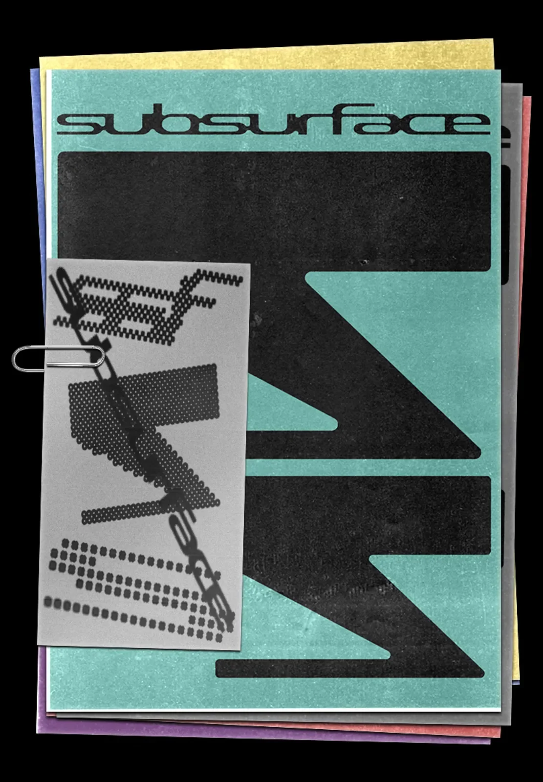
a comprehensive visual identity exploration designed as a versatile foundation for brands within the underground landscape—whether it be a techno record label, an industrial club, or a contemporary streetwear line. The project focuses on the tension between the hidden and the visible, translating "subsurface" layers into a cohesive graphic system.
As a visual designer, my goal with Subsurface was to develop a brand skeleton that explores the intersection of movement and static form. This case study showcases the creative process behind logo construction and the strategic development of art direction, ensuring the brand maintains its core identity across various scales and digital environments.
This identity is currently a foundational concept ready to be tailored and fully developed for a specific brand. If you are looking for a visual identity that resonates with industrial aesthetics and contemporary urban culture, this project can be adapted to your label, clothing brand, or creative studio.
-
Year: 2025
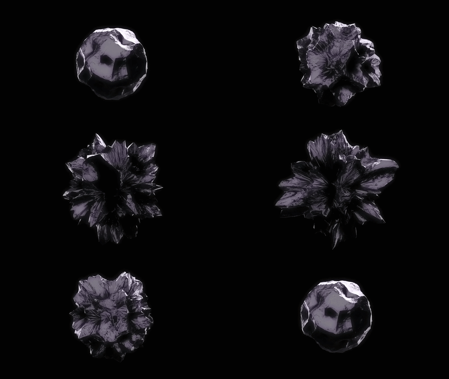
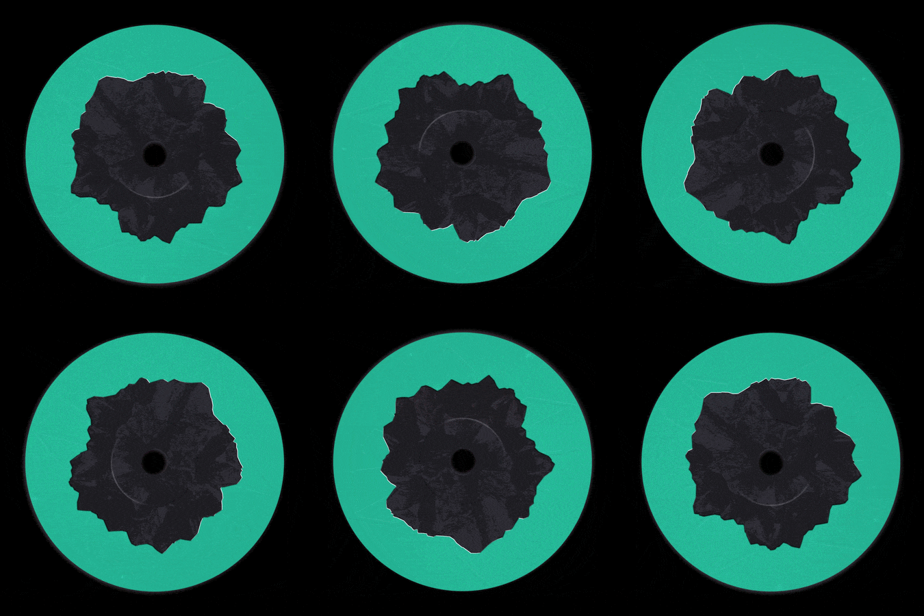
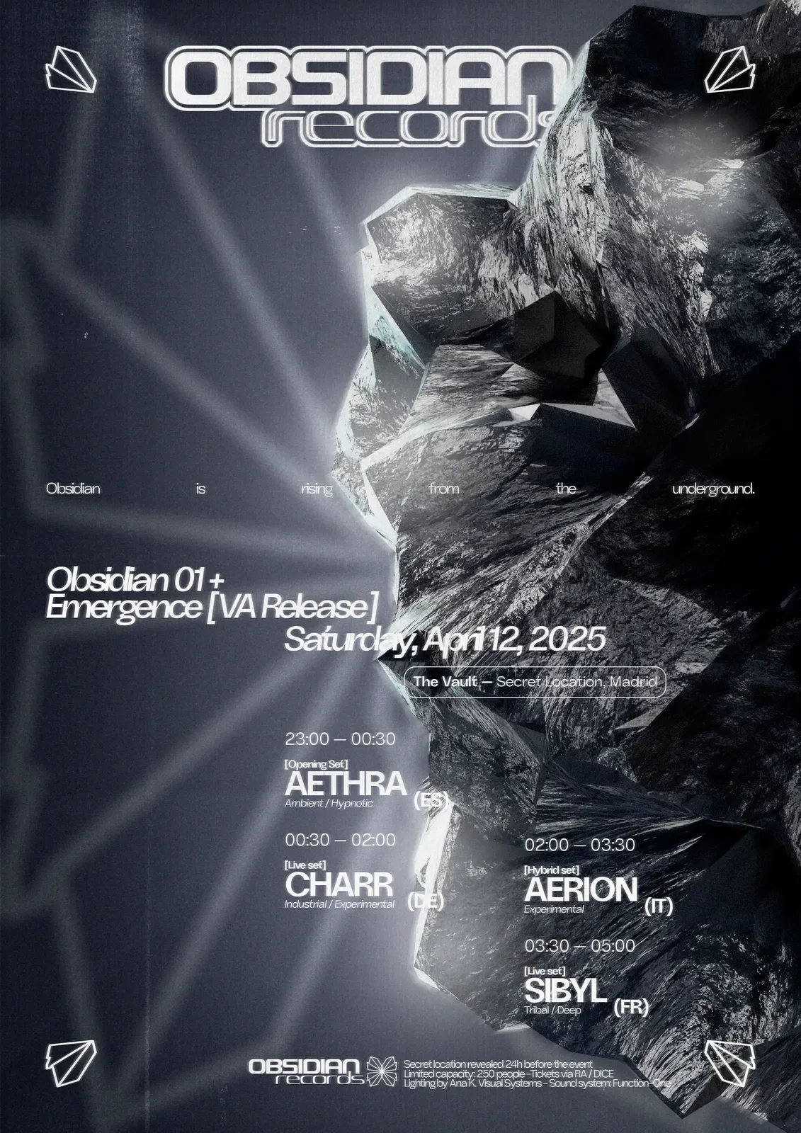
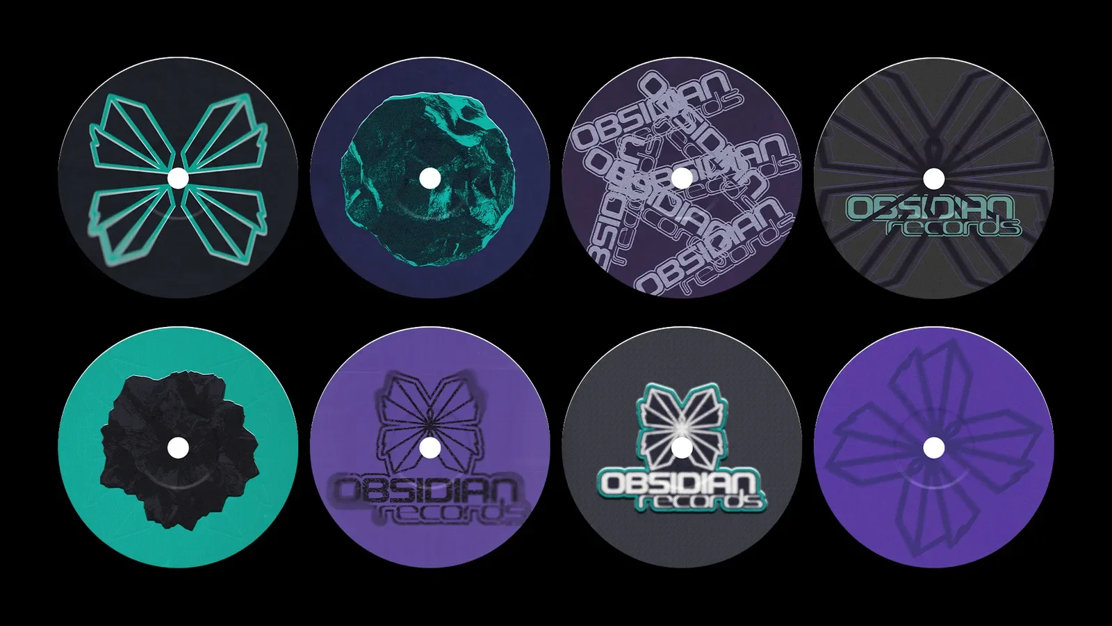
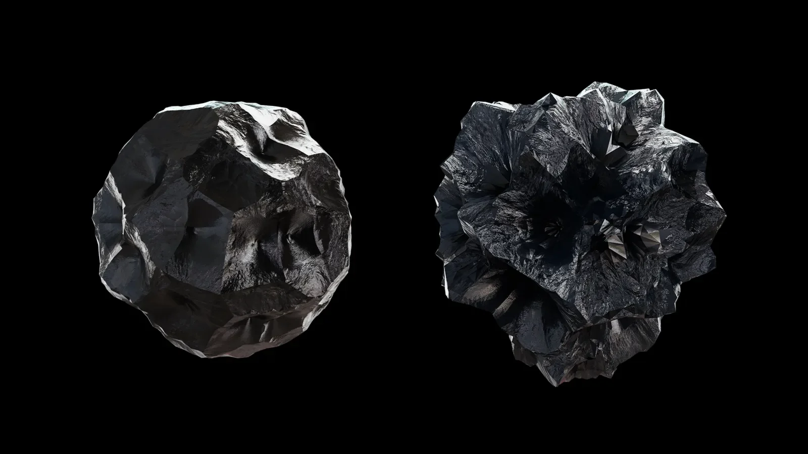
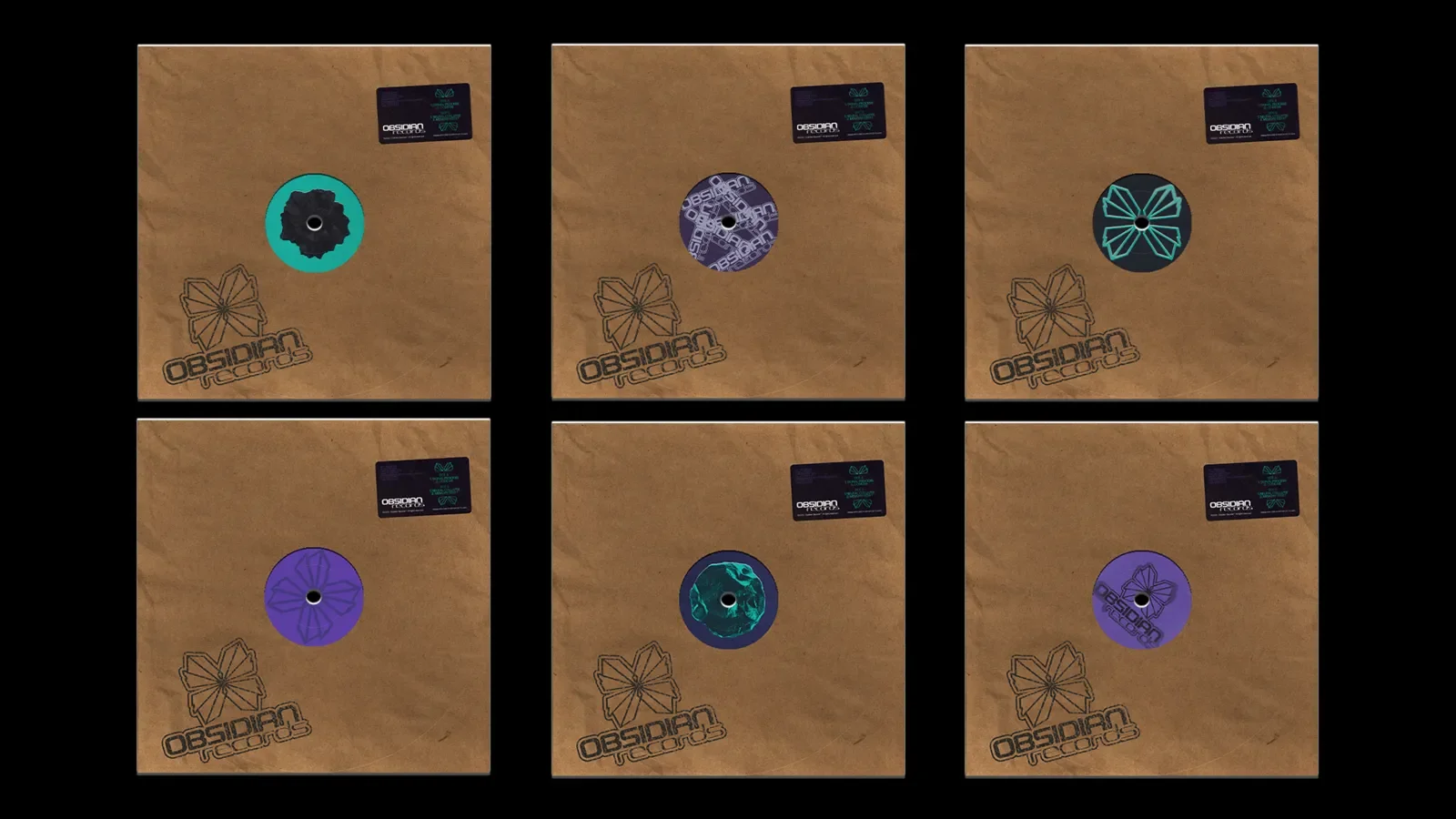
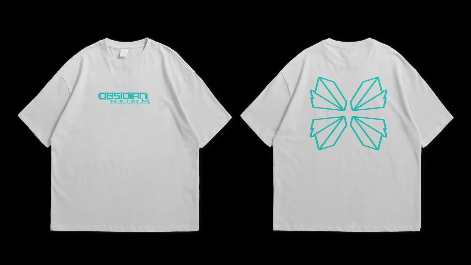
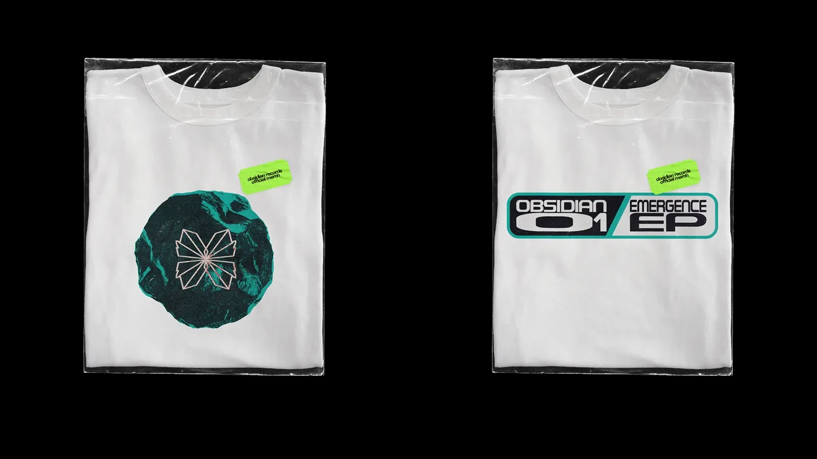
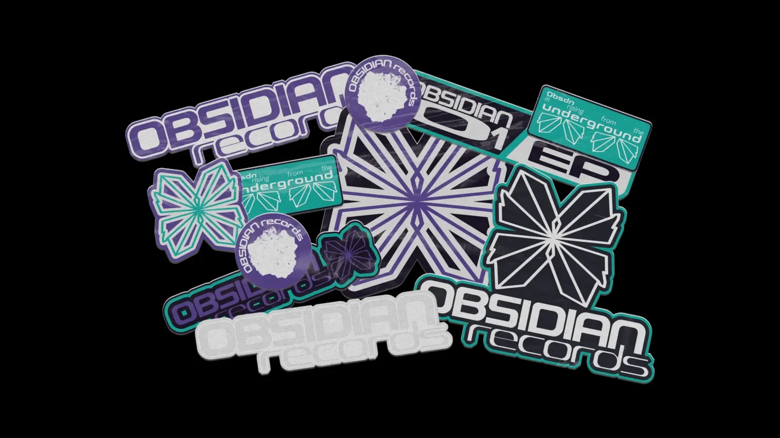
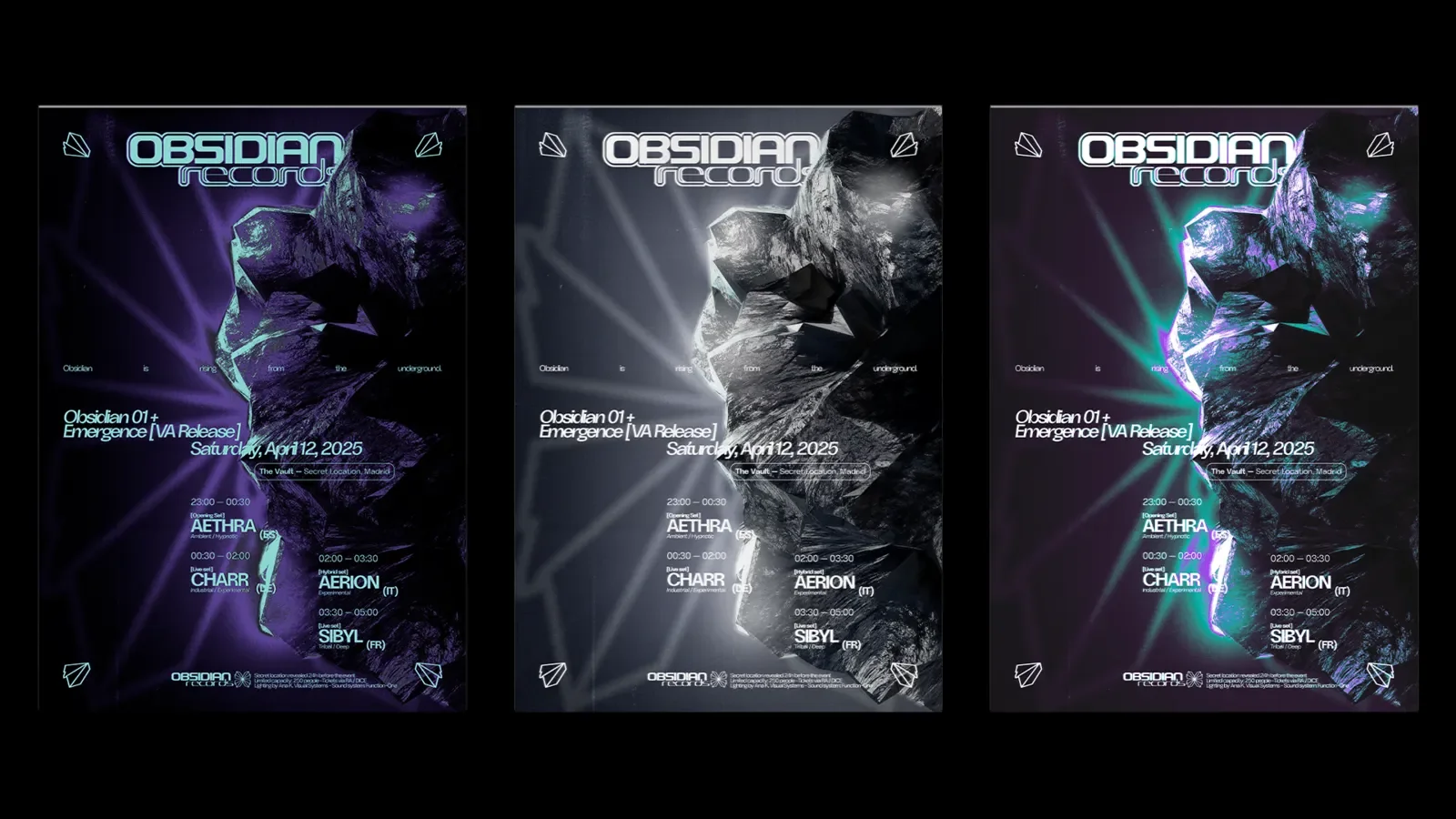
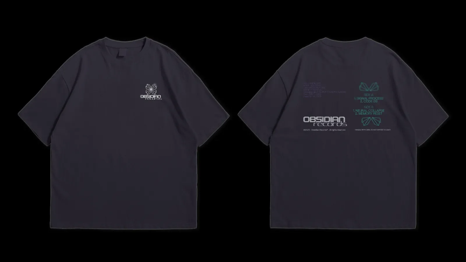
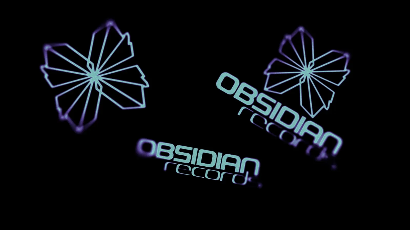
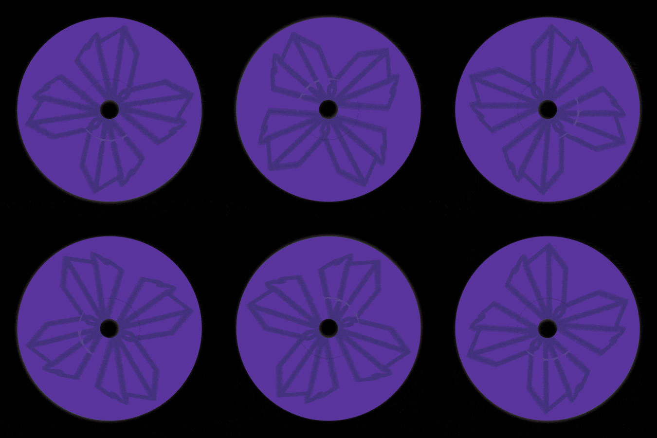
An art direction and branding case study inspired by the raw, physical properties of volcanic glass. As a visual designer specialized in the techno scene, I developed this identity to reflect the abrasive textures and high-pressure energy found in industrial and experimental electronic music.
The project explores the intersection of pressure and heat—elements that define both the formation of obsidian and the sonic intensity of an underground warehouse set.
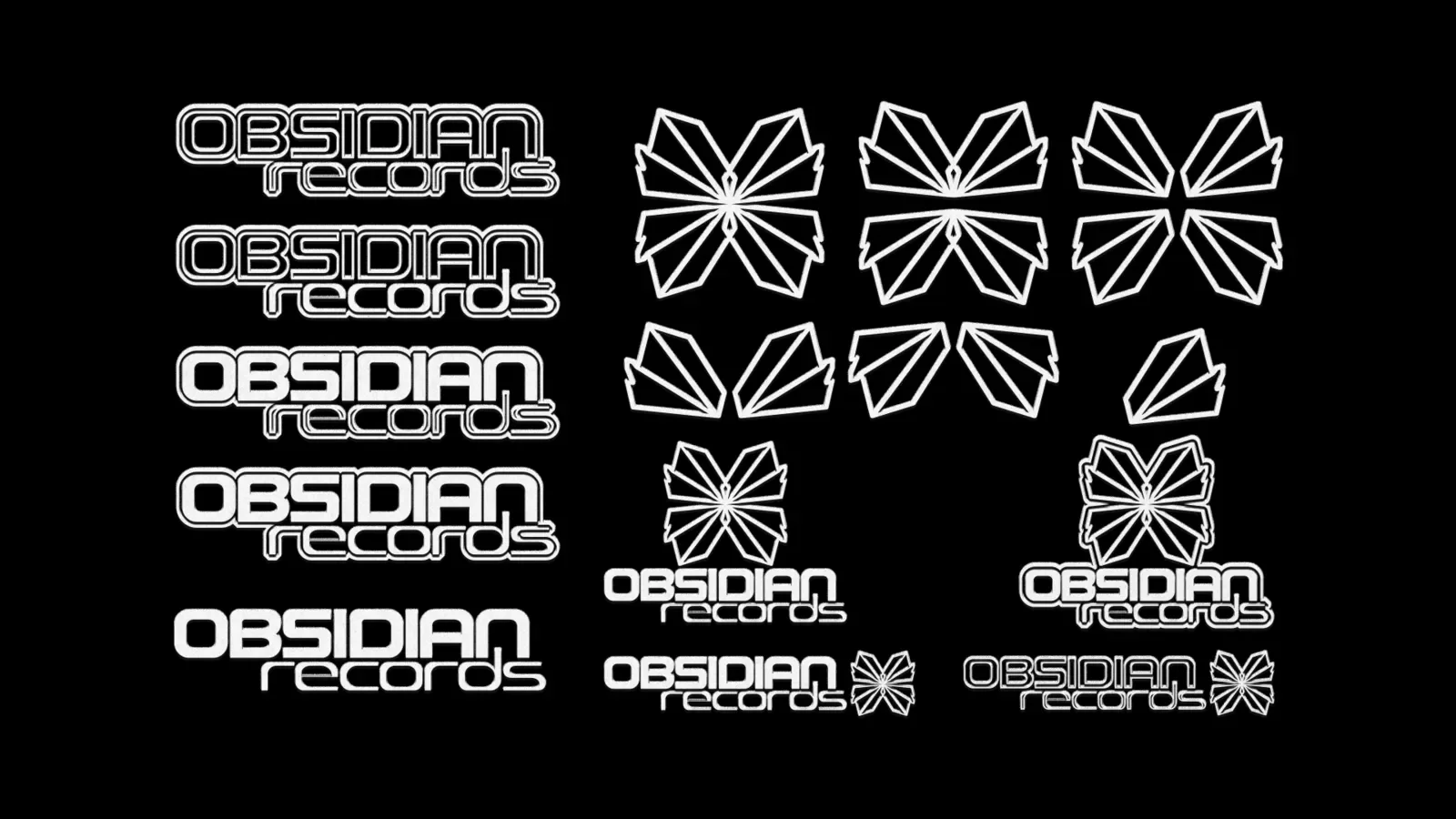
The visual system centers on the preservation of underground culture through raw authenticity. By merging minimalist typography with dark, industrial textures, the brand establishes a powerful presence tailored for emerging producers and independent labels.The art direction prioritizes high-contrast visuals and a "low-tech, high-impact" philosophy, ensuring the label's identity remains consistent from digital platforms to physical dancefloors.
-
Year: 2023
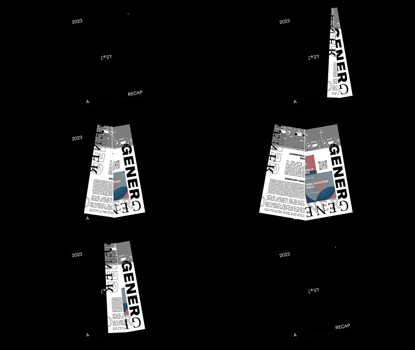
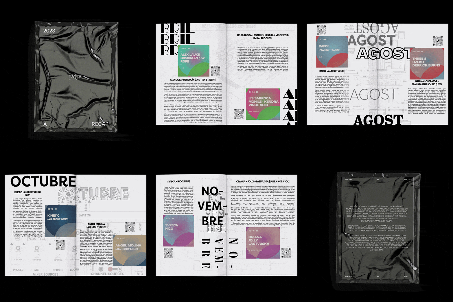
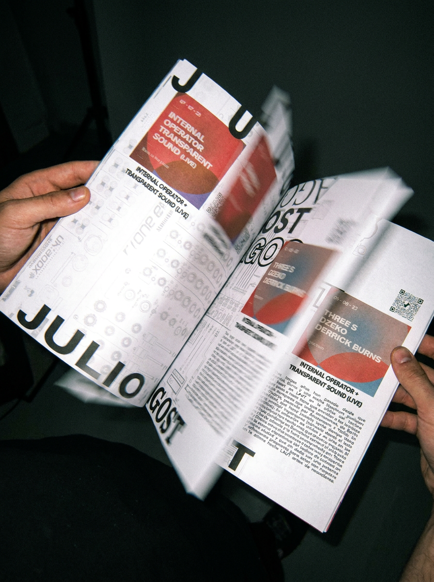
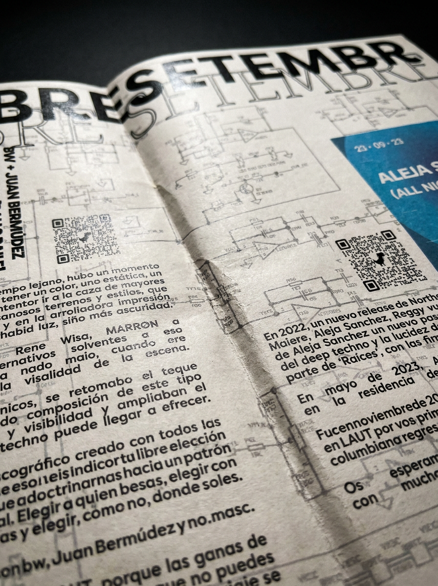
The concept draws from an unlikely reference: Allen & Heath mixing console manuals. A staple in every serious electronic music setup. That technical, functional aesthetic becomes the visual backbone of the project, merged with the raw, self-published spirit of the fanzine format. No editorial rules. No budget. No compromise.
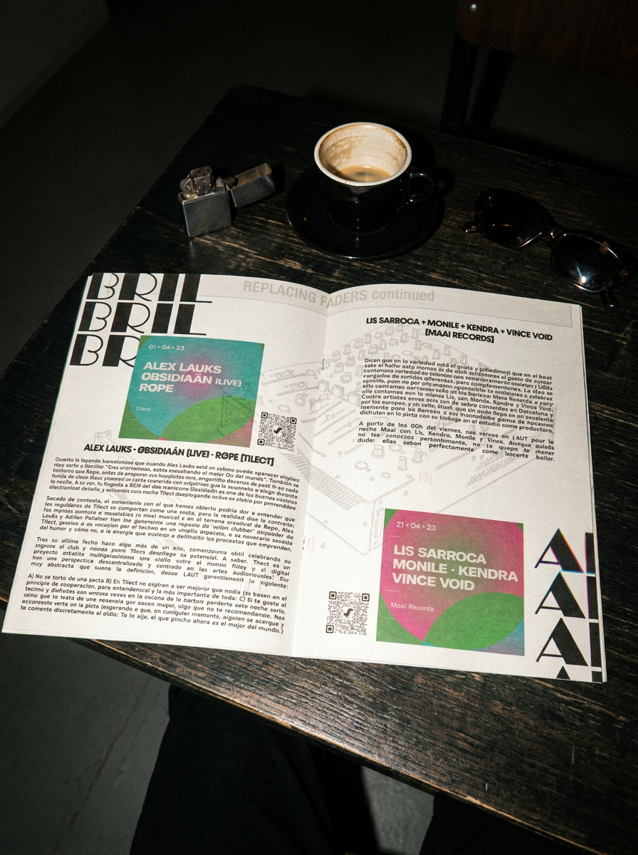
The fanzine compiles a full year of club nights at LAUT, one of Barcelona's most distinctive electronic music spaces, collecting the writings of Vanitydust, a key voice within the local scene, originally written to introduce each artist and frame each night's experience.
Typographic contrasts, layered compositions and visual rhythm define the layout. The design pays homage to the graphic language of the techno scene: industrial, functional and bold, while giving full editorial prominence to the texts themselves, treating them as the narrative core rather than supporting copy.
The result is a hybrid object, halfway between archive and tribute. A celebration of clubbing, community and electronic culture in printed form. Although never officially published, it remains one of the most honest and representative pieces of work I've made.
An exercise in editorial thinking, music and visual storytelling collapsed into a single tangible artifact.